Introduction
Welcome to the User Interface Design and Implementation module. This comprehensive course will guide you through the essential aspects of creating effective, user-friendly digital interfaces. From understanding user needs and applying fundamental design principles to implementing responsive web designs using HTML, CSS, and modern frameworks like Tailwind CSS, you'll gain practical skills in crafting intuitive and visually appealing user interfaces.
We'll explore key concepts in user experience, dive into visual design techniques, and develop hands-on coding skills. By the end of this module, you'll be equipped with the knowledge and tools to design and build engaging, accessible, and responsive user interfaces for the web.
Happy Learning :)
Usability, Learnability, Visibility, Efficiency
Usability
Usability refers to the ease with which users can interact with a system or interface to achieve their goals effectively and efficiently. It is crucial for ensuring user satisfaction, productivity, and overall user experience.
Usability Principles:
-
Learnability: The system should be easy to learn, allowing users to quickly become proficient in using it.
-
Efficiency: The system should enable users to perform tasks quickly and with minimal effort.
-
Memorability: Users should be able to remember how to use the system after a period of non-use.
-
Errors: The system should prevent errors or help users recover from errors easily.
-
Satisfaction: Users should find the system enjoyable, aesthetically pleasing, and engaging.
Visibility
Visibility refers to the degree to which the state and behavior of a system are evident and understandable to users. Visible interfaces help users understand the current state of the system and make informed decisions.
Examples: A button that appears raised or depressed to indicate whether it is clickable or not; progress bars that show the completion status of a task.
Learnability
Learnability refers to the ease with which users can understand and learn to use a system or interface. Learnable interfaces enable users to quickly grasp the functionality and features of a system, reducing the learning curve.
Efficiency
Efficiency refers to the speed and ease with which users can accomplish tasks and goals within a system or interface.
Importance: Efficient interfaces save users time and effort, leading to increased productivity and user satisfaction.
Examples: A spreadsheet software with a comprehensive set of keyboard shortcuts for formatting and data manipulation
Errors and user feedback
Errors and feedback encompass the ways in which a system communicates information about errors, alerts, and user actions to the user. Clear and timely feedback helps users understand and correct errors, preventing frustration and promoting effective system usage.
Errors:
Slips
Silly mistakes that often occur when people aren't paying close attention to what they are doing. So while they intend to perform one action, they slip and end up doing a similar action.
Example: Embarrassing typos in a text message, hitting reply all. Occur when users have the right intention but make unintended actions.
Lapses
Occur when users forget to perform a necessary action or fail to notice important information.
Example: Forgetting a password or forgetting the next step.
Mistakes
Conscious errors that occur when the user's goal is inappropriate. It arises due to misunderstanding of the situation. So when people have incorrect info about the task or system and design that do not match the interface.
Example: Gray button, thinking it's disabled and couldn't submit the form but it was actually a design choice.
Feedback:
-
Visual Feedback: Visual feedback provides users with visual cues or changes in the interface to indicate the result of an action.
Example: Highlighting a selected button, changing the color of a completed form field, or displaying a progress bar during a file upload.
-
Auditory Feedback: Auditory feedback uses sound or audio cues to inform users about the outcome of their actions.
Example: Playing a "ding" sound when a message is sent successfully or provides an error beep when an invalid action is attempted.
-
Tactile Feedback: Tactile feedback involves physical sensations or vibrations that provide users with a sense of confirmation or response.
Example: Haptic feedback on touchscreens when pressing virtual buttons or vibrating notifications on mobile devices.
-
Error Messages: Error messages are specific notifications that inform users about incorrect actions or system failures. Effective error messages should be clear, concise, and provide guidance on how to resolve the error.
Example: Displaying an error message like "Invalid username or password. Please try again" when login credentials are incorrect.
-
Undo/Redo: Undo and redo functionality allows users to revert or repeat actions, providing a way to recover from errors.
Example: Providing an "Undo" button to revert a deleted item or allowing users to redo a formatting change in a document.
-
Help and Documentation: Providing contextual help, tooltips, or access to comprehensive documentation assists users in understanding system functionality, preventing errors, and finding solutions when errors occur.
Understanding User Needs and Goals
Gather as much information as possible about the users. Understanding the target users is essential for designing a user-centered interface. It involves collecting comprehensive information about their demographics, preferences, and behaviors. This information can be obtained through various methods such as user research, analytics data, market research, and user feedback.
User Persona
User personas are fictional representations of target users that are based on real user data and characteristics. They help designers empathize with users and make design decisions that align with their needs and goals.
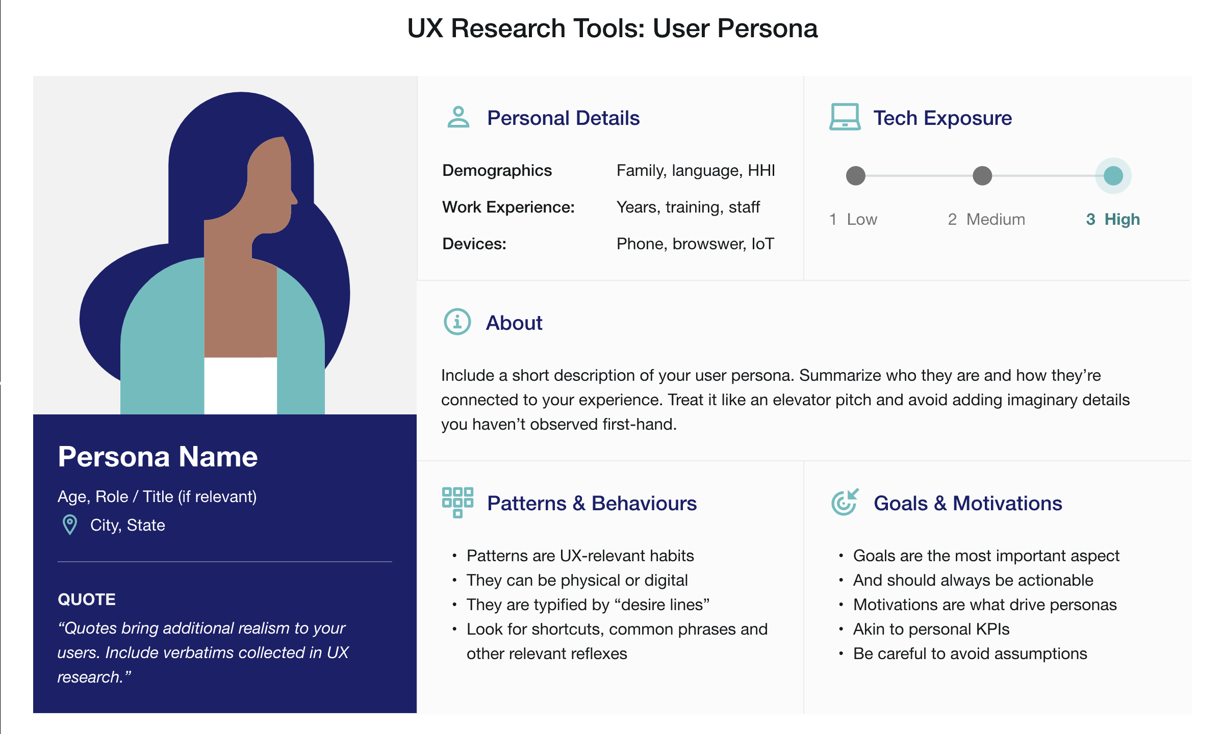
Personas are intended to:
-
Foster empathy: User personas are created to develop a deep understanding of users by embodying their characteristics, needs, and motivations. They help designers empathize with users' perspectives, leading to more user-centered design decisions.
-
Serve as memory aids: User personas act as reference tools that designers can consult throughout the design process. They help designers remember key user attributes, goals, and pain points, ensuring that the design remains focused on user needs.
-
Create a common mental model: User personas facilitate communication and understanding among design teams, stakeholders, and other project members. They provide a shared understanding of who the target users are, helping everyone aligns their efforts towards meeting user expectations.
Laws of UX
1. Fitts's Law
It states that the time to acquire a target is a function of the distance to and size of the target.
There are three key considerations: A. Size - targets should be large enough that the users can easily discern them and accurately select them. B. Space - touch targets should have ample space between them. C. Position - touch targets should be placed in areas of the interface that allow them to be easily acquired.
2. Hick's Law
It states that the time it takes to make a decision increases with the number and complexity of choices available.
It means that, the more choices to choose from, the longer it takes the user to decide on which to interact with. Our goal when creating a service/product is to synthesize information and present it in a way that does not overwhelm the user. Redundancy and excessiveness in design will only create confusion. We can avoid this by breaking down the tasks into smaller steps and simplifying the interface or process.
Example: Previously the landing page of Google had been cluttered and had a lot of options, which indeed was complex and overwhelming. The current page is minimal and is aesthetic. The focus is provided only for the search section, this provides a quick and easy way for people to search the Web.

3. Miller's Law
The average human can keep only 7 (+2) items in their working memory.

Chunking helps to retain information more efficiently. When designing, organize content into smaller chunks to help users scan, process, understand and memorize easily.
4. Tesler's Law (Law of conservation of complexity)
States that for any system there is a certain amount of complexity that cannot be reduced.
As designers, our role is to remove complexity from our interfaces, if not we are shipping that complexity to our users. This can result in frustration and bad user experience. Designers should handle complexity during design and development.
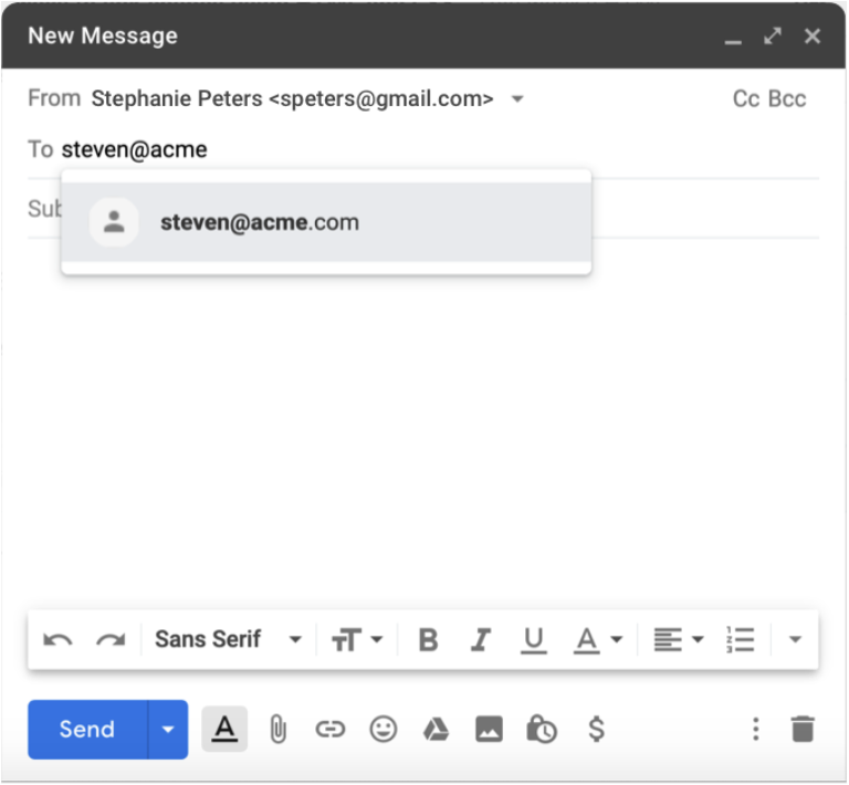
Example: When you write an email, there are two required pieces of information: the sender's address and the recipient's address. The email cannot be sent if either of these is missing, and therefore it's a necessary complexity. To reduce this complexity, a modern email client will do two things: pre-populate the sender (it can do this because it is aware of your email address), and provide suggestions for the recipient as you begin to type their address, based on prior emails and/or your contacts. The complexity is not entirely gone, but the experience of writing an email is made a little simpler by removing the complexity of filling in the addresses. Taking that a step further, Gmail now leverages artificial intelligence (AI) within your emails through a feature called Smart Compose. This intelligent feature can scan what you have typed and use that content to suggest the next words or phrases to complete that sentence.
5. Jakob's Law
Users spend most of their time on other sites, and they prefer your site to work the same way as all the other sites they already know. It is about creating designs that conform to established models of how interfaces look and feel. It will reduce the burden on users. Users find it easier to navigate through an interface when the design resembles the one they already know from other interfaces.
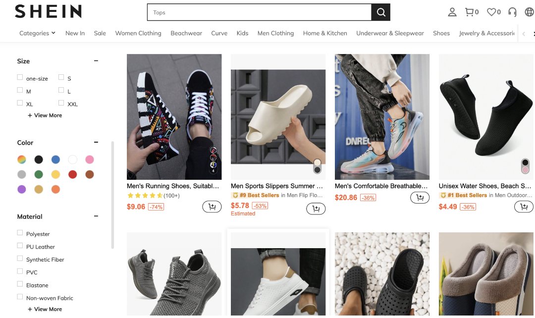
Example: E-commerce websites. Online shoppers have certain expectations based on their previous experiences with other e-commerce sites. For example, they expect to see product images, descriptions, and prices. They also expect to see a shopping cart icon in the top right corner of the site and an add-to-bag button on the right side of the product page.
6. Postel's Law
Be conservative in what you do, be liberal in what you accept from others.
Since humans and computers communicate and process information in different ways, the design should bridge the communication gap.
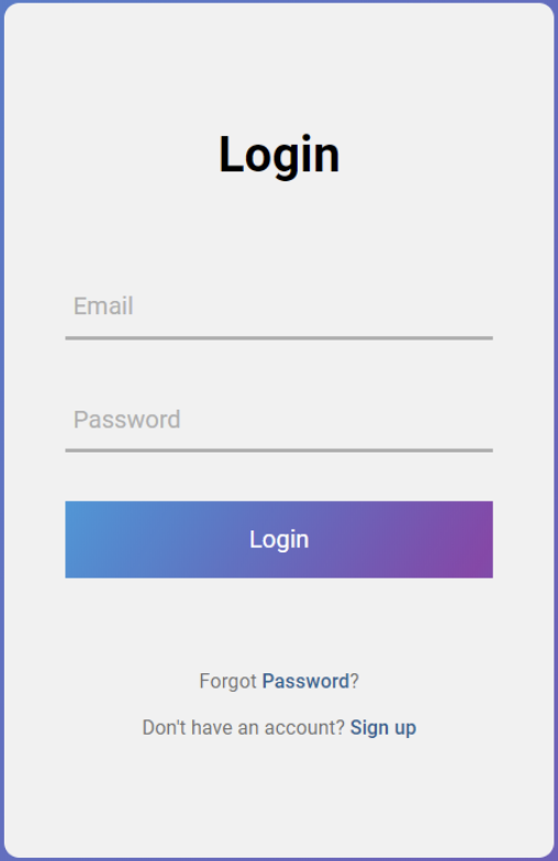
Example 1: Forms - be conservative in how much information you ask the user to provide. Any non-essential data should be left out or kept as optional. The more fields you require them to fill out the more effort you are asking of them.
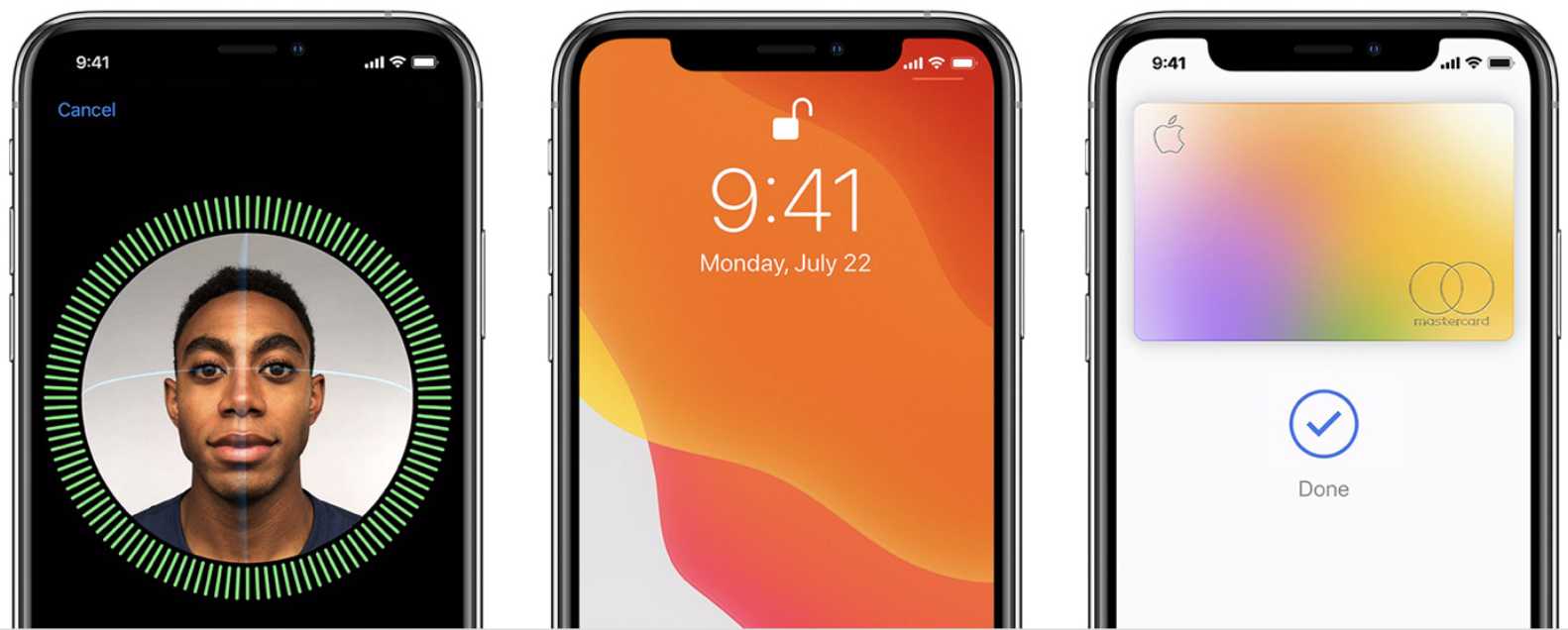
Example 2: Apple's Face ID - the facial recognition without the need to provide a username/password. It is robust enough to accept varying types of human inputs meaning it is more flexible.
7. The Peak-End Rule
People judge an experience largely based on how they felt at its peak and at its end.
It is also known as memory bias. Instead of considering the entire duration of the experience, we tend to focus on an emotional peak and on the end. People recall negative experiences more vividly than the positive ones. This observation strongly suggests that we should pay close attention to these critical moments to ensure users evaluate an overall experience positively. Identify the moments when your product is most useful, valuable or entertaining and design to delight the users.
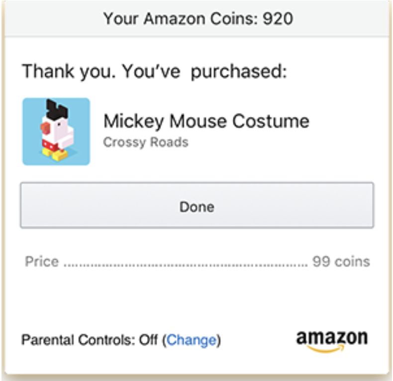
Example: An eCommerce platform that dwells on the price will make the user feel bad about spending that cash. After all, losing money isn't just a bad experience; it's a horrible experience. So instead of ending the purchase with a big ol' bill, why not end it by reminding the customer what they're getting? That's what Amazon does. After you finish spending money, it reminds you why you spent that money in the first place.
8. The Aesthetic-Usability Effect
Users often perceive aesthetically pleasing design as design that's more usable.
Aesthetically pleasing designs can influence usability, create positive emotional response, increase the perception of usability. People form an opinion about a website within a few seconds of seeing it, and the visual appeal is a primary determining factor. So, an aesthetically pleasing design can lead users to believe that the design actually works better.
9. The von Restorff Effect
When multiple similar objects are present, the one that differs from the rest is most likely to be remembered.
It is a powerful guideline for how to use contrast to direct people's attention to the most relevant content. Some of the factors are color, shape, size, position and so on.
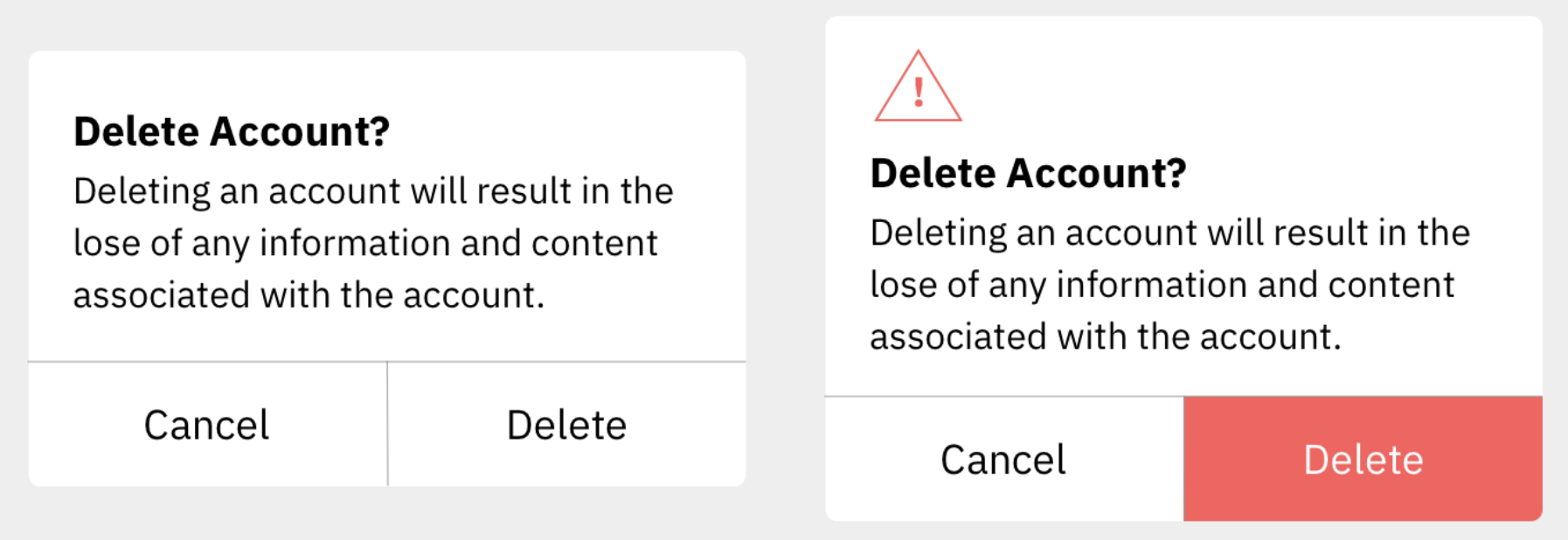
Example: one with buttons that are visually indistinct from one another, and another with emphasis placed on the most important button. The lack of visual contrast in the modal on the left could easily lead to people accidentally selecting the wrong action. By placing a visual emphasis on the destructive action, the version on the right will not only help guide users who want to delete their accounts to the correct option but will also help those who don't intend to delete their accounts avoid accidentally selecting this option. For extra safety, there is also a warning icon included in the header of the modal on the right to help draw attention and communicate the importance of the content within the modal.
10. The Doherty Threshold
Productivity soars when a computer and its users interact at a pace (<400 ms) that ensures that neither has to wait on the other.
It means that performance is critical to a good user experience. Emotions can easily turn to frustration and leave a negative lasting impact when users who are trying to achieve are met with slow processing, lack of feedback or more load times. Progress bars help make waiting more tolerable. Animation is one way to visually engage people while loading or processing.
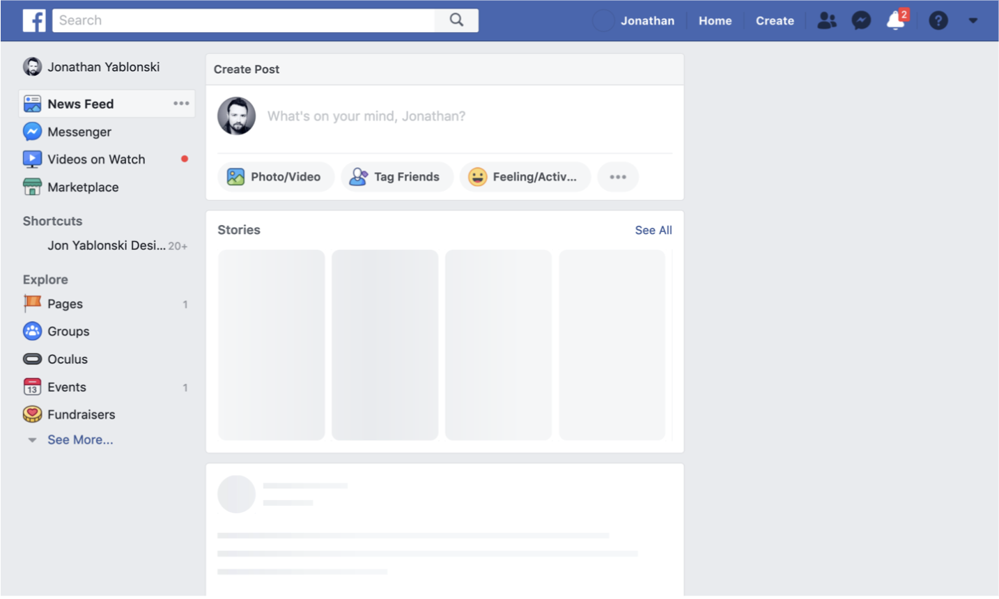
Example: the presentation of a skeleton screen of Facebook when content is loading. This technique makes the site appear to load faster by instantly displaying placeholder blocks in the areas where content will eventually appear. The blocks are progressively replaced with actual text and images once they are loaded. This reduces the impression of waiting, which increases the perception of speed and responsiveness even if the content is loading slowly.
Introduction to Visual Hierarchy
Visual Hierarchy is a powerful technique that can help you create a better experience for your users and solve key problems with your product. It provides structure to guide users through a product, which can improve their experience and help you create well-designed interfaces.
Hierarchy is a visual design principle that designers use to show the importance of each page/screen's contents by using various features, which we'll explore in the following sections.
Elements of Visual Hierarchy
Size
Size is used to grab the attention of the user. The bigger the design element, the more it grabs attention. Size can add emphasis to a design frame or content, making it more significant.
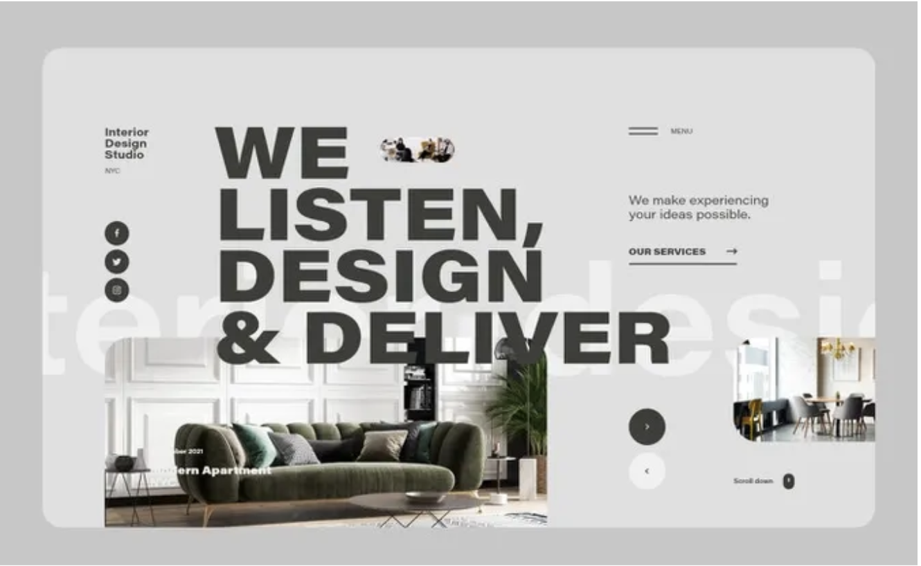
A great example of size can be found in the interior design image above. The first thing that catches your eye is the text that explains what the company does.
Color
Bright colors stand out more than muted or dull colors. Color helps set the mood for your app or website. They can reflect the personality of your brand, attract users, and better communicate your message.
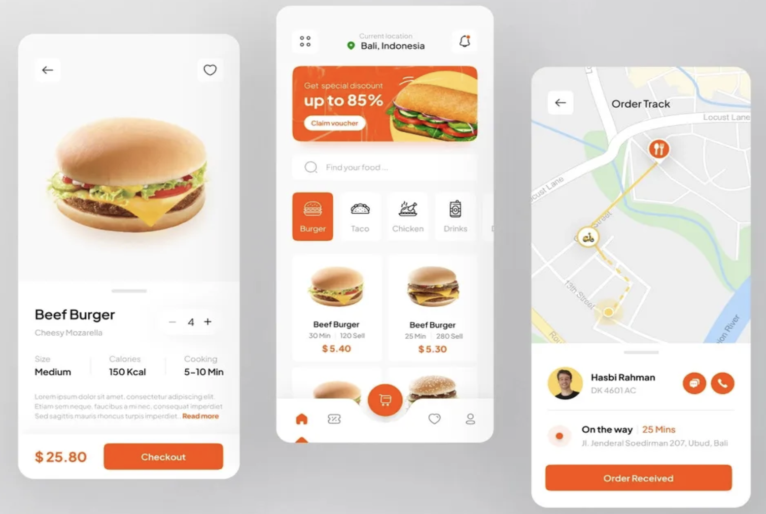
Example: The bright color above helps draw attention to the important elements on the screen. The primary color serves as a call to action. By using the primary color on buttons & text prices, users are able to anticipate how things will work and understand what action to take.
Alignment
Alignment is used to provide visual structure. Elements aligned on the same path can help them feel associated with each other, making it easier to scan. Alignment is used to form unity in design elements.
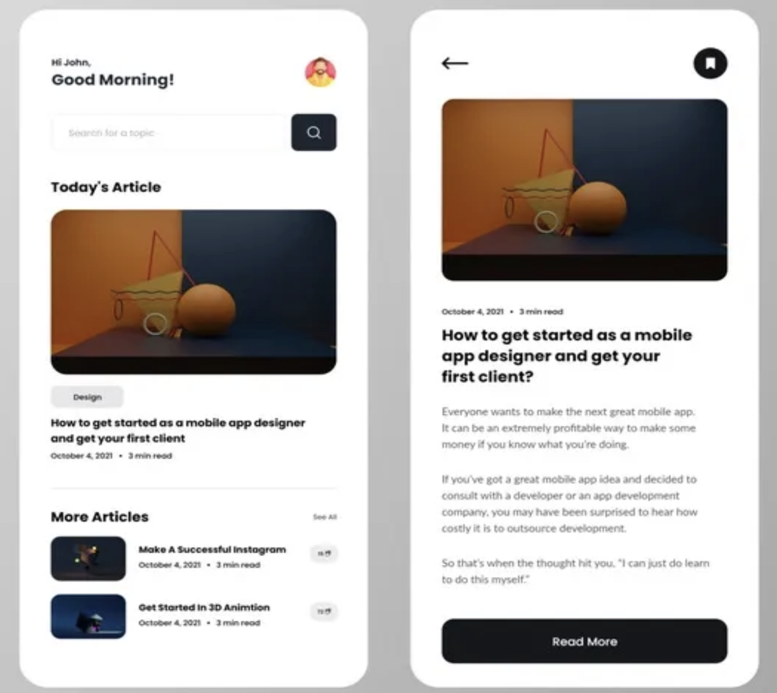
Like in the example above, the text is aligned to the left providing a better reading experience for the user. Centered text can be used for call-to-actions.
Aligning components makes the design cleaner and more structured. Alignment helps the user better understand the connections between different elements without the need for external helpers.
Repetition
Repetition is the reusing of the same or similar design elements. It is used to keep the eyes of the user familiar with the design elements of the app or website.
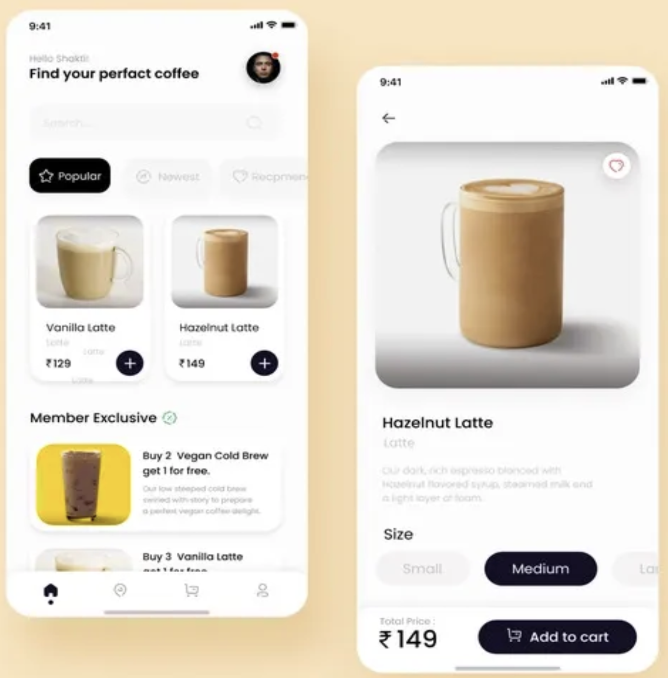
Example: Coffee ordering app
Repetition can be in many forms: Typography, Color, Size, Lines, Shapes, etc. The buttons in the design above have a dark color which makes them stand out. The Color of the button is used consistently on both screens and on different features such as the filter and the "add to cart" feature which are all call-to-action buttons. Using the same color throughout the app leads the user in a clear direction.
By using repetition we are being consistent and improving the experience for the user and making them feel comfortable as we are making users anticipate how things work.
Proximity
Proximity is the idea that similar design elements close together are perceived to be related. Elements that are placed apart mean that they belong to a separate group.

Example: Blogging App- Proximity can be determined by whitespace or color. Take the screen in the middle for example. Two elements contain blog information. The two elements are related but also they are separated by whitespace. By presenting information in scannable blocks, the user is able to scan and read the information provided to them. By using whitespace, we guide the user's eyes from one blog content to another.
White Space
White space, also known as "negative space," is empty space around the content and functional elements of a page. The basic role of white space is to let your design breathe by reducing the amount of text and functional elements that users see at once.
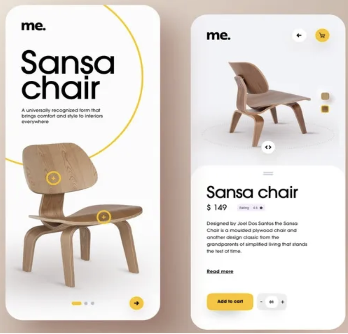
In the example given, whitespace is used between different UI elements, such as text, to enhance readability. Take a look at the screen on the left. Since the chair is the largest element on the page, and there is a lot of whitespace around it, it seems to be the focus of attention. An element becomes more noticeable with more negative space around it.
Essentially, the user's attention is drawn to an element with more negative space simply because there is nothing else in that area that draws their attention. Meanwhile, the right screen has elements spaced out for the user to be able to process the information easily.
Typography and Font Pairing
Typography deals with the font family, typefaces, and readability. Using too many fonts can be distracting for users. Try to stick with two or three fonts, typically a heading line font for featured type and a body font for readability.
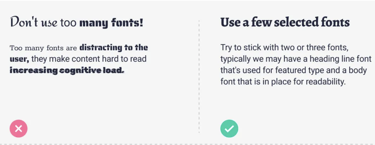
Font Pairing: font combinations. It is the creative technique of putting fonts together harmoniously, in a way that pleases the eye and matches the intended message. Font pairing is not only the way fonts work together but also how these fonts complement the copy.
Color Theory and Harmonious Palettes
Color theory involves the primary rules and guidelines that surround color and its use in creating aesthetically pleasing visuals. Selecting the right color combination is crucial for creating harmonious color palettes.
Emphasizing by De-emphasizing
Sometimes, to make an element stand out, it's more effective to de-emphasize the elements competing with it. This technique can be applied to various interface elements, from navigation items to entire sections of a page.
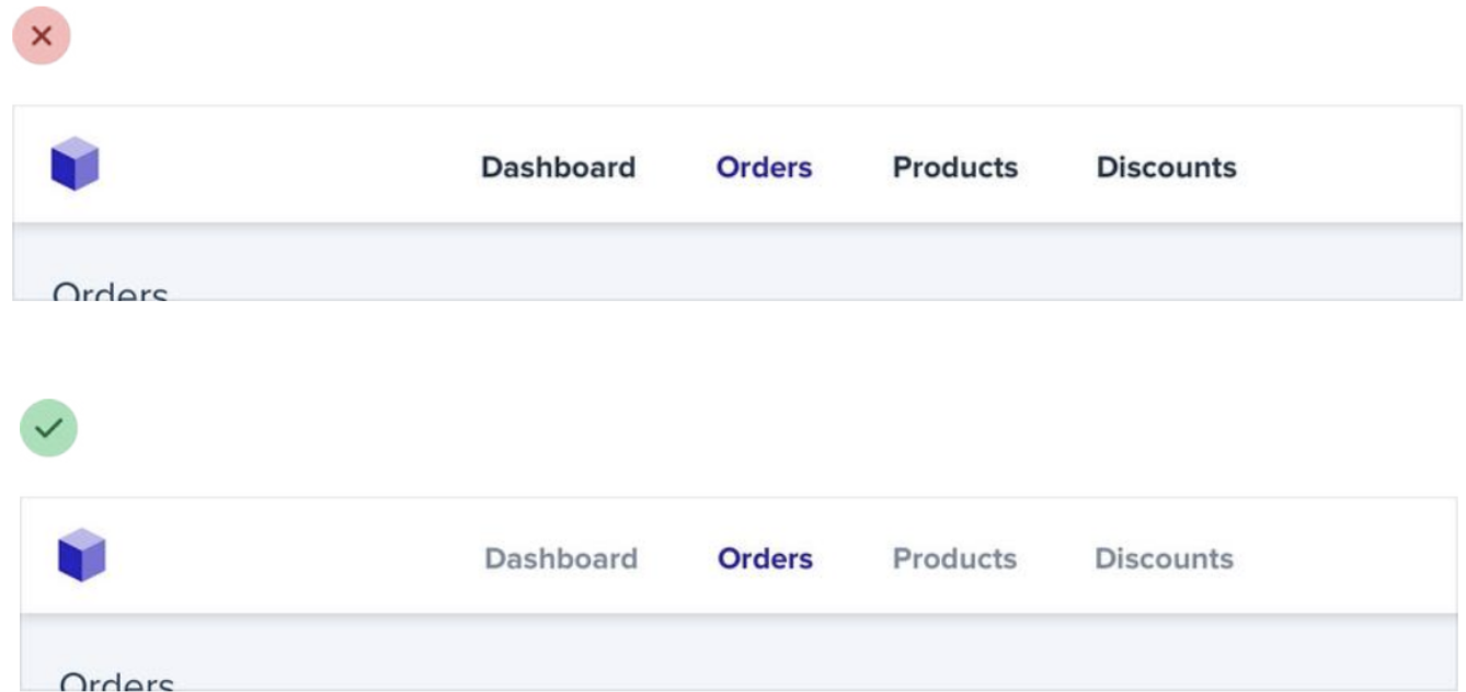
For example, despite trying to make this active nav item “pop” by giving it a different color, it still doesn’t really stand out compared to the inactive items:
When you run into situations like this, instead of trying to further emphasize the element you want to draw attention to, figure out how you can de-emphasize the elements that are competing with it. You could do that by giving the inactive items a softer color so they sit more in the background.
You can apply this thinking to bigger pieces of an interface as well. For example, if a sidebar feels like it’s competing with your main content area, don’t give it a background color — let the content sit directly on the page background instead.
Labels
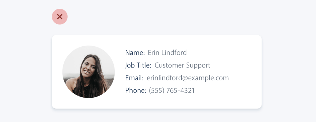
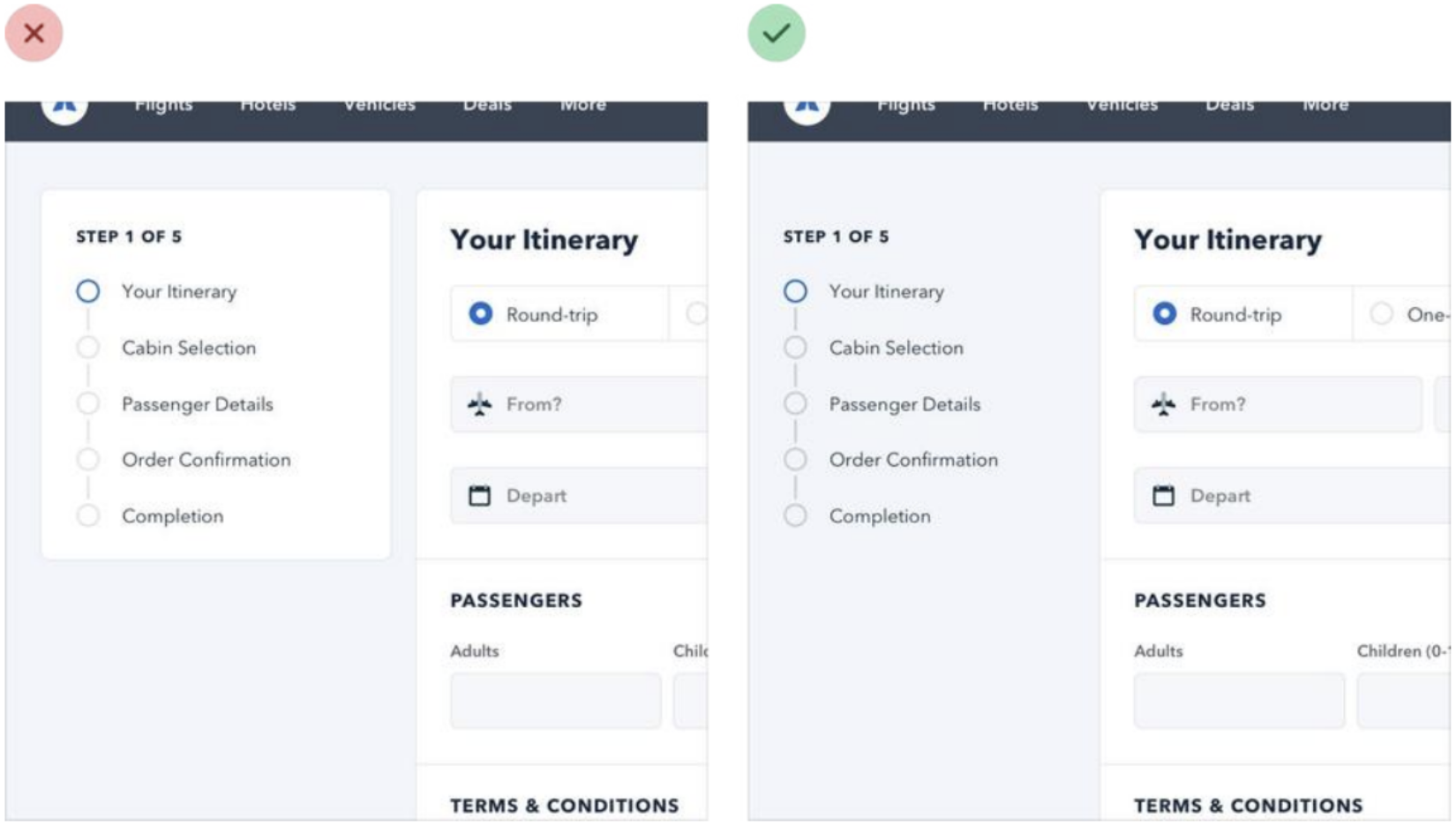
The problem with this approach is that it makes it difficult to present the data with any sort of hierarchy; every piece of data is given equal emphasis.
You might not need a label at all
In a lot of situations, you can tell what a piece of data is just by looking at the format.
For example, 'sonam@example.com' is an email address, (555) 765-4321 is a phone number, and $19.99 is a price.
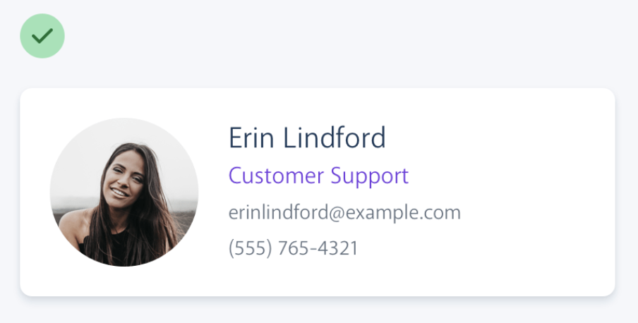
When the format isn't enough, the context often is. When you see the phrase "Customer Support" listed below someone's name in an employee directory, you don't need a label to make the connection that that is the department the person works in.
When you're able to present data without labels, it's much easier to emphasize important or identifying information, making the interface easier to use while at the same time making it feel more "designed".
Effective Use of Labels
Labels can sometimes be unnecessary or even detrimental to the clarity of an interface. Learn when to use labels, when to emphasize them, and how to present data without labels for a cleaner, more intuitive design.
If you're designing an interface where you know the user will be looking for the label, it might make sense to emphasize the label instead of the data.
This is often the case on information-dense pages, like the technical specifications of a product.
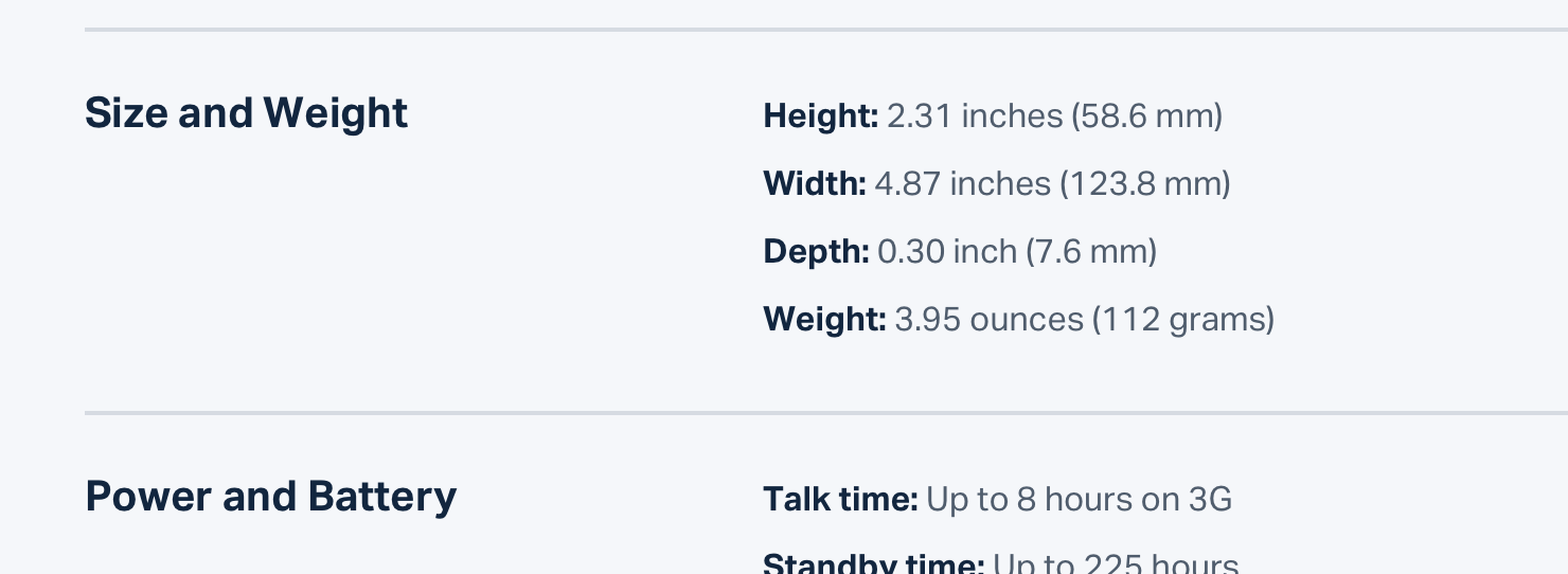
Don't de-emphasize the data too much in these scenarios; it's still important information. Simply using a darker color for the label and a slightly lighter color for the value is often enough.
Spacing and Layout
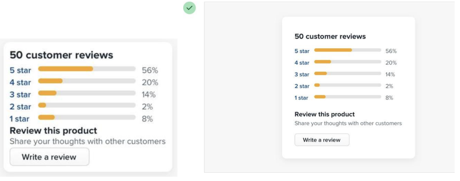
One of the easiest ways to clean up a design is to give every element a little more room to breathe. Proper spacing and layout can significantly improve the readability and overall aesthetic of your design.
When designing for the web, white space is almost always added to a design — if something looks a little too cramped, you add a bit of margin or padding until things look better.
Microinteractions
Small, functional animations that support the user by giving visual feedback and displaying changes more clearly.
Microinteractions contain a large number of digital elements, but not every element is part of a microinteraction. Static elements that are always present on the screen are not microinteractions because they do not have a distinct trigger. Additionally, flows composed of multiple actions are not microinteractions.
There are two types of microinteractions: User Triggered and System Triggered.
Example:
-
Scrollbar
Gives visual feedback to the user changing location within a page (User triggered) -
Pull-to-refresh animation
Gives visual feedback to a user action (User triggered) -
Swipe animation
Gives visual feedback that a user has swiped an element (User triggered) -
Digital alarm
Gives auditory (and visual) feedback to time condition being met (System triggered)
Responsive Web Design
Responsive Web Design is an approach to design web content that appears regardless of the resolution governed by the device. If you open a responsive site on the desktop and change the browser window's size, the content will dynamically rearrange itself to fit the browser window. On mobile phones, the site checks for the available space and then presents itself in the ideal arrangement. Designers should catch up with this diversity and cater to various screen sizes.
Principles of Responsive Mobile Web Design
In 2010, Ethan Marcotte coined the term responsive web design. Marcotte defines three RWD principles:
Fluid Grid Layout
This fixed unit used to define the grid size was a major problem towards supporting multiple devices.
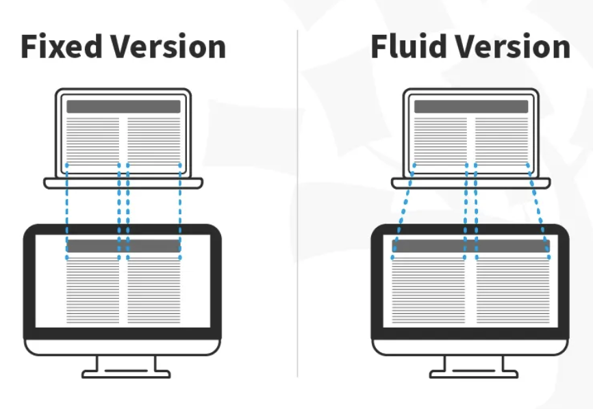
In this image, you can see that the fixed version of the content has the same width regardless of the device, whereas in the fluid version, the content fills the available screen space of the device.
Fluid Images
When you use fluid grids to define a layout using relative values (such as percentages), nothing on a layout will have a constant size across all devices. This means that images in your layout will need to be resized for each screen real estate. That's where fluid images enter the picture!
Much like water, fluid images take on the size of their container. For non-photographic images, such as icons, you can use SVG files. These file formats are lightweight, and you can scale them to any resolution without quality loss.
CSS3 Media Queries
Developers use CSS media queries to define breakpoints based on specific device classes. Breakpoints are specific screen sizes at which the layout of your website will change.
Adaptive Web Design
Introduced in 2011 by web designer Aaron Gustafson. It has multiple fixed layout sizes. It selects the layout most appropriate for the screen. Designers don't need to worry about how elements will be arranged when screen size changes and have more control over designs.
On the flip side, we can't create designs for all types of devices and screen sizes, and if users open a website on a screen of uncommon size, the design might not be displayed correctly. In this case, responsive design can accommodate websites on a wider range of screen sizes
Creating responsive layouts and fluid grids
Creating responsive layouts and fluid grids Responsive layouts and fluid grids are essential components of responsive web design.
Here are some key points:
Use relative units: Instead of fixed pixel values, use relative units like percentages, em, or rem for widths and sizes. This allows elements to scale proportionally across different screen sizes.
Implement a grid system: Use CSS Grid or Flexbox for creating flexible, responsive layouts. These modern CSS layout systems make it easier to create complex, responsive designs.
Breakpoints: Define breakpoints where your layout will change to accommodate different screen sizes. Use media queries to apply different styles at these breakpoints.
Flexible images: Use max-width: 100% to ensure images don't exceed their container's width. Consider using the picture element for art direction and serving different image sizes.
Designing mobile navigation and menu patterns
Effective mobile navigation is crucial for a good user experience. Here are some popular patterns and considerations:
Hamburger menu:
A widely recognized icon (☰) that expands to reveal navigation options. Saves space but can hide important navigation items.
Bottom navigation bar:
Places key navigation items at the bottom of the screen for easy thumb access. Ideal for apps or websites with 3-5 main sections.
Expandable menus:
Accordion-style menus that expand and collapse to show subcategories. Helps organize complex navigation structures.
Search-centered navigation:
Prominent search bar for content-heavy sites. Allows users to quickly find what they're looking for.
Progressive disclosure:
Reveal additional options or content as the user navigates deeper into the site. Helps manage complex navigation without overwhelming the user.
Sticky headers:
Keep important navigation elements visible as users scroll. Ensures easy access to key functions or menu items.
Exercises
-
Choose a page from an online platform and replicate it in Figma, applying the concepts you've learned in class.
-
Design few pages for your personal portfolio website in Figma, including responsive layouts and interactive prototyping.
Pages to Create:
-
Home/Landing Page
-
About Me Page
-
Project/work showcase Page
-
HTML5 and semantic markup
HTML (HyperText Markup Language) is the code that is used to structure a web page and its content. For example, content could be structured within a set of paragraphs, a list of bulleted points, or using images and data tables.
HTML consists of a series of elements, which you use to enclose, or wrap, different parts of the content to make it appear a certain way, or act a certain way.

HTML Elements and Attributes
Elements can also have attributes that look like the following:

Attributes contain extra information about the element that you don't want to appear in the actual content. Attributes usually come in name/value pairs like: name="value"
Void elements
Some elements have no content and are called void elements. Take the element that we already have in our HTML page:
html <img src="images/firefox-icon.png" alt="My test image" />
This contains two attributes, but there is no closing tag and no inner content. This is because an image element doesn't wrap content to affect it. Its purpose is to embed an image in the HTML page in the place it appears.
<html></html> — the <html> element
This element wraps all the content on the entire page and is sometimes known as the root element. It also includes the lang attribute, setting the primary language of the document.
<head></head> — the <head> element
This element acts as a container for all the stuff you want to include on the HTML page that isn't the content you are showing to your page's viewers. This includes things like keywords and a page description that you want to appear in search results, CSS to style the content, character set declarations, and more.
<title></title> — the <title> element
This sets the title of your page, which is the title that appears in the browser tab the page is loaded in. It is also used to describe the page when you bookmark or favorite it.
<body></body> — the <body> element
This contains all the content that you want to show to web users when they visit your page, whether that's text, images, videos, games, playable audio tracks, or whatever else.
Headings
HTML headings are defined with the <h1> to <h6> tags.
<h1>defines the most important heading.<h6>defines the least important heading.
Paragraphs
HTML paragraphs are defined with the <p> tag.
Text Formatting
Formatting elements were designed to display special types of text:
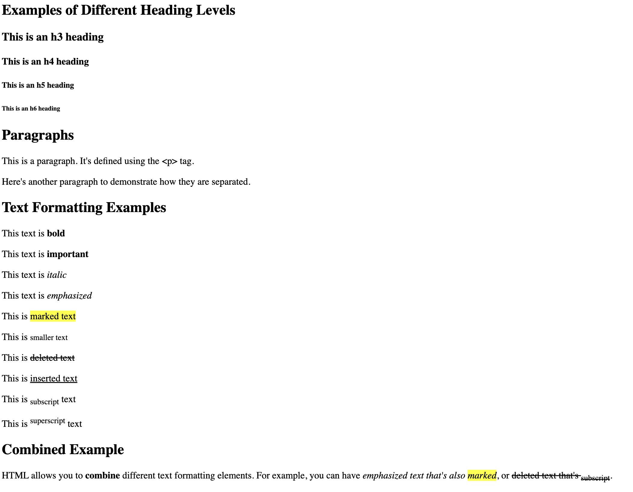
<b>- Bold text<strong>- Important text (bold)<i>- Italic text<em>- Emphasized text (Italic)<mark>- Marked text (highlighted)<small>- Smaller text<del>- Deleted text (strikethrough)<ins>- Inserted text (Underlined)<sub>- Subscript text<sup>- Superscript text
<!-- <h1> defines the most important heading -->
<!-- <h6> defines the least important heading -->
<h2>Examples of Different Heading Levels</h2>
<h3>This is an h3 heading</h3>
<h4>This is an h4 heading</h4>
<h5>This is an h5 heading</h5>
<h6>This is an h6 heading</h6>
<!-- Paragraphs -->
<!-- HTML paragraphs are defined with the <p> tag -->
<h2>Paragraphs</h2>
<p>This is a paragraph. It's defined using the <p> tag.</p>
<p>Here's another paragraph to demonstrate how they are separated.</p>
<!-- Text Formatting -->
<h2>Text Formatting Examples</h2>
<!-- Formatting elements were designed to display special types of text -->
<p>This text is <b>bold</b> </p>
<p>This text is <strong>important</strong></p>
<p>This text is <i>italic</i></p>
<p>This text is <em>emphasized</em></p>
<p>This is <mark>marked text</mark></p>
<p>This is <small>smaller text</small></p>
<p>This is <del>deleted text</del></p>
<p>This is <ins>inserted text</ins></p>
<p>This is <sub>subscript</sub> text</p>
<p>This is <sup>superscript</sup> text</p>
<!-- Combined example -->
<h2>Combined Example</h2>
<p>HTML allows you to <strong>combine</strong> different text formatting elements.
For example, you can have <em>emphasized text that's also <mark>marked</mark></em>,
or <del>deleted text that's <sub>subscript</sub></del>.</p>
output:
Links
HTML links are defined with the <a> tag. The link's destination is specified in the href attribute. Attributes are used to provide additional information about HTML elements.
 <h2>Links</h2>
    <!-- HTML links are defined with the <a> tag -->
    <!-- The link's destination is specified in the href attribute -->
    <!-- Attributes are used to provide additional information about HTML elements -->
    <p>This is a <a href="https://www.example.com">link to Example.com</a>.</p>
    <p>This is a <a href="https://www.google.com" target="_blank">link that opens in a new tab</a>.</p>
Output:
Links
This is a link to Example.com.
This is a link that opens in a new tab.
Lists
An unordered list starts with the <ul> tag. Each list item starts with the <li> tag.
The list items will be marked with bullets (small black circles) by default.
The Type Attribute:
disc(default)circlesquare
 <h3>Unordered Lists</h3>
     <!-- An unordered list starts with the <ul> tag -->
     <!-- Each list item starts with the <li> tag -->
     <!-- The list items will be marked with bullets (small black circles) by default -->
     <h4>Default Unordered List</h4>
     <ul>
         <li>Item 1</li>
         <li>Item 2</li>
         <li>Item 3</li>
     </ul>

     <!-- The Type Attribute for Unordered Lists -->
     <h4>Unordered List with Circle Bullets</h4>
     <ul type="circle">
         <li>Item 1</li>
         <li>Item 2</li>
         <li>Item 3</li>
     </ul>

     <h4>Unordered List with Square Bullets</h4>
     <ul type="square">
         <li>Item 1</li>
         <li>Item 2</li>
         <li>Item 3</li>
     </ul>
Output:
Unordered Lists
Default Unordered List
- Item 1
- Item 2
- Item 3
Unordered List with Circle Bullets
- Item 1
- Item 2
- Item 3
Unordered List with Square Bullets
- Item 1
- Item 2
- Item 3
Ordered List
An ordered list starts with the <ol> tag. Each list item starts with the <li> tag.
The list items will be marked with numbers by default.
The Type Attribute
The type attribute of the <ol> tag defines the type of the list item marker:
| Type | Description |
|---|---|
type="1" | The list items will be numbered with numbers (default) |
type="A" | The list items will be numbered with uppercase letters |
type="a" | The list items will be numbered with lowercase letters |
type="I" | The list items will be numbered with uppercase Roman numbers |
type="i" | The list items will be numbered with lowercase Roman numbers |
<h3>Ordered Lists</h3>
     <!-- An ordered list starts with the <ol> tag -->
     <!-- Each list item starts with the <li> tag -->
     <!-- The list items will be marked with numbers by default -->
     <h4>Default Ordered List</h4>
     <ol>
         <li>First item</li>
         <li>Second item</li>
         <li>Third item</li>
     </ol>

     <!-- The Type Attribute for Ordered Lists -->
     <h4>Ordered List with Uppercase Letters</h4>
     <ol type="A">
         <li>Item A</li>
         <li>Item B</li>
         <li>Item C</li>
     </ol>

     <h4>Ordered List with Lowercase Letters</h4>
     <ol type="a">
         <li>Item a</li>
         <li>Item b</li>
         <li>Item c</li>
     </ol>

     <h4>Ordered List with Uppercase Roman Numerals</h4>
     <ol type="I">
         <li>Item I</li>
         <li>Item II</li>
         <li>Item III</li>
     </ol>

     <h4>Ordered List with Lowercase Roman Numerals</h4>
     <ol type="i">
         <li>Item i</li>
         <li>Item ii</li>
         <li>Item iii</li>
     </ol>
Output:
Ordered Lists
Default Ordered List
- First item
- Second item
- Third item
Ordered List with Uppercase Letters
- Item A
- Item B
- Item C
Ordered List with Lowercase Letters
- Item a
- Item b
- Item c
Ordered List with Uppercase Roman Numerals
- Item I
- Item II
- Item III
Ordered List with Lowercase Roman Numerals
- Item i
- Item ii
- Item iii
Images
HTML images are defined with the <img> tag.
<img src="images/img1.png" alt="My test image" />
The source file (src), alternative text (alt), width, and height are provided as attributes In the alt attribute, you specify descriptive text for users who cannot see the image.
There are two ways to specify the URL in the src attribute:
1. Absolute URL - Links to an external image that is hosted on another website
2. Relative URL - Links to an image that is hosted within the website. Here, the URL does not include the domain name. If the URL begins without a slash, it will be relative to the current page. It is almost always best to use relative URLs. They will not break if you change domain.
Video
Uses the <video> element.
<video width="320" height="230">
        <source src="media/video1.mp4">
</video>
Other attributes:
- autoplay
- muted
Audio
use the <audio> element
Youtube
use the <iframe> element
Tables
HTML tables allow you to arrange data into rows and columns. They are created using the <table> tag, along with several other tags to define the structure.
Basic Table Structure
<table>: Defines the entire table<tr>: Defines a table row<th>: Defines a table header cell<td>: Defines a table data cell
Here's an example of a basic table:
<table border="1">
  <tr>
    <th>Header 1</th>
    <th>Header 2</th>
  </tr>
  <tr>
    <td>Row 1, Cell 1</td>
    <td>Row 1, Cell 2</td>
  </tr>
  <tr>
    <td>Row 2, Cell 1</td>
    <td>Row 2, Cell 2</td>
  </tr>
</table>
Output:
| Header 1 | Header 2 |
|---|---|
| Row 1, Cell 1 | Row 1, Cell 2 |
| Row 2, Cell 1 | Row 2, Cell 2 |
Table Sections
You can divide your table into three sections:
<thead>: Groups the header content<tbody>: Groups the body content<tfoot>: Groups the footer content
Example:
<table border="1">
        <thead>
          <tr>
            <th>Name</th>
            <th>Amount (Nu)</th>
          </tr>
        </thead>
        <tbody>
          <tr>
            <td>Sonam</td>
            <td>2500</td>
          </tr>
          <tr>
            <td>Tashi</td>
            <td>3000</td>
          </tr>
        </tbody>
        <tfoot>
          <tr>
            <td>Sum</td>
            <td>5500</td>
          </tr>
        </tfoot>
      </table>
Output:
| Name | Amount (Nu) |
|---|---|
| Sonam | 2500 |
| Tashi | 3000 |
| Sum | 5500 |
Spanning Columns and Rows
You can make a cell span multiple columns or rows using the colspan and rowspan attributes:
<table border="1">
  <tr>
    <th>Name</th>
    <th colspan="2">Phone</th>
  </tr>
  <tr>
    <td>Sonam Tashi</td>
    <td>975-1234</td>
    <td>975-5678</td>
  </tr>
</table>
Output:
| Name | Phone | |
|---|---|---|
| Sonam Tashi | 975-1234 | 975-5678 |
Forms
Uses the <form> element
Basic form structure
<form action="/submit-form" method="post">
  <!-- Form elements go here -->
</form>
<!-- The 'action' attribute specifies where to send the form data when submitted -->
<!-- The 'method' attribute specifies the HTTP method to use (usually "get" or "post") -->
<form action="/submit-form" method="post">
  <!-- Form title -->
  <h2>Registration Form</h2>

  <!-- Text input for full name -->
  <!-- The 'for' attribute of <label> should match the 'id' of the input it's associated with -->
  <label for="fullname">Full Name:</label>
  <!-- 'required' attribute makes this field mandatory -->
  <input type="text" id="fullname" name="fullname" required><br><br>

  <!-- Email input -->
  <label for="email">Email:</label>
  <input type="email" id="email" name="email" required><br><br>

  <!-- Password input -->
  <label for="password">Password:</label>
  <input type="password" id="password" name="password" required><br><br>

  <!-- Radio buttons for gender selection -->
  <p>Gender:</p>
  <!-- Radio buttons with the same 'name' form a group; only one can be selected -->
  <input type="radio" id="male" name="gender" value="male">
  <label for="male">Male</label><br>
  <input type="radio" id="female" name="gender" value="female">
  <label for="female">Female</label><br>
  <input type="radio" id="other" name="gender" value="other">
  <label for="other">Other</label><br><br>

  <!-- Dropdown menu for country selection -->
  <label for="country">Country:</label>
  <select id="country" name="country">
    <!-- Each <option> represents a choice in the dropdown -->
    <option value="usa">United States</option>
    <option value="canada">Canada</option>
    <option value="uk">United Kingdom</option>
    <option value="australia">Australia</option>
  </select><br><br>

  <!-- Checkboxes for multiple interest selection -->
  <p>Interests:</p>
  <!-- Checkboxes allow multiple selections -->
  <input type="checkbox" id="technology" name="interests" value="technology">
  <label for="technology">Technology</label><br>
  <input type="checkbox" id="sports" name="interests" value="sports">
  <label for="sports">Sports</label><br>
  <input type="checkbox" id="music" name="interests" value="music">
  <label for="music">Music</label><br><br>

  <!-- Textarea for longer text input -->
  <label for="bio">Bio:</label><br>
  <!-- 'rows' and 'cols' attributes set the initial size of the textarea -->
  <textarea id="bio" name="bio" rows="4" cols="50"></textarea><br><br>

  <!-- Submit button to send the form data -->
  <input type="submit" value="Register">
</form>
Output:
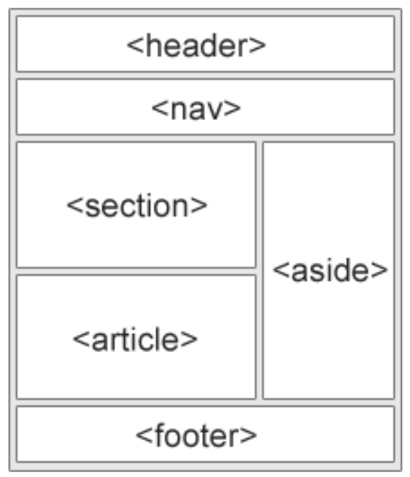
Semantic elements
Semantic elements are used to define different parts of a web page
Examples of semantic elements:
<article><aside><details><figcaption><figure><footer><header><main><mark><nav><section><summary><time>
Non-semantic elements
They don't have any meaning. They don't tell anything about the content they contain. These tags are used to apply CSS styling to content.
Non-semantic elements:
<div>- used to group elements together<span>- used to style text
Exercises
1. List
Create an HTML page with the following components:
- An unordered list of your courses for the semester.
- An ordered list of your daily class schedule (Monday to Friday).
- An unordered list of your to-do items for the week (at least 7 items).
- A nested list showing your study goals:
- Main topics (unordered list)
- Subtopics for each main topic (ordered lists)
2. Form
Create an HTML form for a college seminar registration. The form should include the following input fields:
- Full Name
- Date of Birth
- Gender (Male, Female, Other)
- Email Address
- Password
- Phone Number
- Preferred Seminar Time
- Meal Preference (Vegetarian, Non-Vegetarian, Vegan)
- Submit button
3. Table
Create an HTML page with a table representing your weekly course schedule (timetable). The table should include:
- Days of the week as column headers (Monday to Friday)
- Time slots as row headers (e.g., 9:00 AM-11:00 AM, etc.)
CSS Selectors
Selectors target the HTML elements on your pages. They allow you to add styles based on their ID, class, type, attribute.
Types of selectors:
- Simple Selectors
- Element Selector
- Id Selector
- Class Selector
- Universal Selector
- Group Selector
- Attribute Selector
- Pseudo-Class Selector
- Pseudo-Element Selector
Simple Selectors
Element Selector
Selects HTML elements based on their tag names.
Id Selector
Targets an HTML element with a specific id attribute.
Class Selector
Selects elements with a particular class attribute.
/* element selector */
p {
    color: blue;
}

/* id selector */
#container {
    color: red;
}

/* class selector */
.intro {
    color: green;
}
Universal Selector:
Used to select all the elements in an HTML document. It will be applied to each and every HTML element on the page
/* universal selector */
* {
    color: purple;
}
Group Selector:
It is used to style all comma-separated elements with the same style.
Suppose you want to apply common styles to different selectors, instead of writing rules separately you can write them in groups
/* grouping selector */
h2, h3 {
    color: orange;
}
Attribute Selector
It is used to select the elements with a specified attribute or attribute value.
/* attribute selector */
a[href] {
    color: brown;
}
Pseudo-class Selector
It is used to style a special type of state of any element.
Example: It is used to style an element when a mouse cursor hovers over it.
/* pseudo-class selector*/
a:link {
    color: yellow;
}
Pseudo-element Selector
It is used to style any specific part of the element.
Example- It is used to style the first letter or the first line of any element.
/* pseudo-element selector */
p::first-line {
    color: pink;
}
CSS Properties
CSS properties are the various attributes that you can use to style and format HTML elements on a web page.
Each property has a specific set of allowed values, and these properties control different aspects of an element's appearance or behavior.
Color Properties:
color: Sets the text colorbackground-color: Sets the background color
Text Properties:
font-family: Specifies the fontfont-size: Sets the text sizefont-weight: Controls text boldnesstext-align: Aligns text (left, right, center, justify)
Box Model Properties:
width,height: Set element dimensionsmargin: Controls space outside an elementborder: Sets element borders
Layout Properties:
display: Specifies how an element should be displayedposition: Controls element positioningfloat: Places an element to the left or right of its container
Flexbox Properties:
flex-direction: Sets the direction of flex itemsjustify-content: Aligns flex items along the main axis
Grid Properties:
grid-template-columns: Defines columns in a grid layoutgrid-gap: Sets gaps between grid items
Colors
Colors can be specified using:
- Color names:
red,blue, etc. - Hexadecimal values:
#FF0000for red - RGB values:
rgb(255, 0, 0)for red - RGBA values:
rgba(255, 0, 0, 0.5)for semi-transparent red - HSL values:
hsl(0, 100%, 50%)for red - HSLA values:
hsla(0, 100%, 50%, 0.5)for semi-transparent red
Typography
CSS properties for text styling include:
font-family: Sets the fontfont-size: Controls text sizefont-weight: Sets boldnessfont-style: For italic or oblique texttext-decoration: For underline, overline, or line-throughtext-transform: Changes text caseline-height: Controls line spacing
/* Color examples */
.color-examples {
    color: red; /* Named color */
    background-color: #00FF00; /* Hexadecimal green */
    border: 2px solid rgb(0, 0, 255); /* RGB blue */
    box-shadow: 2px 2px 5px rgba(0, 0, 0, 0.5); /* RGBA for shadow */
}

/* Typography examples */
body {
    font-family: Arial, sans-serif; /* Primary and fallback fonts */
    font-size: 16px; /* Base font size */
    line-height: 1.5; /* Line height for readability */
}

h1 {
    font-size: 2em; /* Relative to base font size */
    font-weight: bold;
    text-transform: uppercase;
}

p {
    font-style: italic;
    text-decoration: underline;
}
Box model and layout
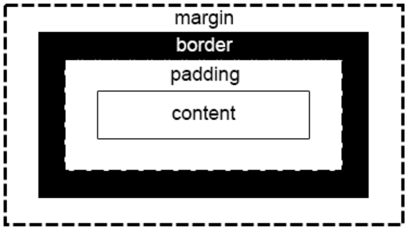
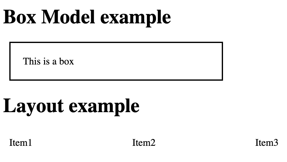
The CSS box model is fundamental to layout and spacing in web design. It consists of:
- Content: The actual content of the box
- Padding: Space between the content and the border
- Border: A line around the padding and content
- Margin: Space outside the border
 <head>
 <style>
       /* Box model example */
        .box {
            width: 300px; /* Content width */
            padding: 20px; /* Space inside the border */
            border: 2px solid black; /* Border */
            margin: 10px; /* Space outside the border */
        }

        /* Layout example */
        .container {
            display: flex; /* Use flexbox for layout */
            justify-content: space-between; /* Space items evenly */
        }

        .item {
            flex: 1; /* Grow to fill available space */
            margin: 10px; /* Space between items */
        }

    </style>
</head>
<body>
    <h1>Box Model example</h1>
    <div class="box">This is a box</div>

    <h1>Layout example</h1>
    <div class="container">
        <div class="item">Item1</div>
        <div class="item">Item2</div>
        <div class="item">Item3</div>
    </div>
</body>
Output:
Styling Lists
In HTML, there are two main types of lists:
- unordered lists (
<ul>) - the list items are marked with bullets - ordered lists (
<ol>) - the list items are marked with numbers or letters
The CSS list properties allow you to:
- Set different list item markers for ordered lists
- Set different list item markers for unordered lists
- Set an image as the list item marker
- Add background colors to lists and list items
The list-style-type property specifies the type of list item marker:
ul {
    list-style-type: square;
}

ol {
    list-style-type: upper-roman;
}
The list-style-image property specifies an image as the list item marker.
ul {
  list-style-image: url('sqpurple.gif');
}
The list-style-position property specifies the position of the list-item markers (bullet points).
list-style-position: outside; means that the bullet points will be outside the list item. The start of each line of a list item will be aligned vertically. This is default.
list-style-position: inside; means that the bullet points will be inside the list item. As it is part of the list item, it will be part of the text and push the text at the start.
ul.list1 {
  list-style-position: outside;
}

ul.list2 {
  list-style-position: inside;
}
Styling Tables
CSS Table Properties
1. Border
The border property is used to specify borders for table elements.
 /* border: table_width table_color; */

   th,td {
        /* Styling the border. */
        border: 1px solid black;
    }
2. Border Collapse
The border-collapse property is used to control the appearance of the adjacent borders that touch each other.
/* border-collapse: collapse/separate; */

 table {

        /* Styling border collapse */
        border-collapse: collapse;
    }
3. Border Spacing
Border Spacing property specifies the space between the borders of the adjacent cells.
/* border-spacing: value; */

 table {
        /* Styling the border-spacing between adjacent cells. */
        border-spacing: 10px;
    }
4. Caption Side
Caption Side property is used for controlling the placement of caption in the table. By default, captions are placed above the table.
/* caption-side: top/bottom; */

table {
        /* Controlling the placement of caption. */
        caption-side: top;
    }
5. Empty cells
Empty cells property specifies whether or not to display borders and background on empty cells in a table.
/* empty-cells:show/hide; */

table {
        /* Hiding empty cells border */
        empty-cells: hide;
    }
6. Zebra-striped table
To create a zebra-striped table, use the nth-child() selector and add a background-color to all even (or odd) table rows or columns.
/* striped rows */

tr:nth-child(even) {
  background-color: #f2f2f2;
}


/* striped columns */

col:nth-child(even) {
  background-color: #f2f2f2;
}
7. Table layout
The Table layout property is used to set up the layout algorithm used for the table.
/* table-layout:auto/fixed; */

table {
        /* Layout of table is auto. */
        table-layout: auto;
    }
Styling Forms
Styling Input Fields:
CSS can be used to style input fields (e.g., text fields, checkboxes, radio buttons, dropdown menus) to match the design of the website. Properties like border, background-color, padding, font-size, and border-radius can be applied to input elements to customize their appearance.
/* Example of Input styling properties */
input[type="text"] {
  border: 1px solid #ccc;
  border-radius: 4px;
  padding: 8px 12px;
  font-size: 16px;
  background-color: #f8f8f8;
  transition: border-color 0.3s ease;
}
Customizing Labels:
Labels associated with form elements can be styled using CSS to improve readability and alignment. Properties like color, font-weight, text-transform, and margin can be used to customize label appearance and position relative to input fields.
/* Example of Label styling properties */

label {
  display: block;
  margin-bottom: 5px;
  font-weight: 600;
  color: #333;
  text-transform: uppercase;
  font-size: 14px;
  letter-spacing: 0.5px;
}
Layout and Alignment:
CSS can control the layout and alignment of form elements within the form container. Techniques like flexbox or grid layout can be used to create responsive and visually pleasing form layouts, ensuring consistency across different devices and screen sizes.
/* Example of layout properties */

.form-container {
  display: flex;
  flex-wrap: wrap;
  gap: 20px;
}
Pseudo-classes for Interaction:
CSS pseudo-classes can be applied to form elements to style them based on user interaction. For example, :hover can be used to change the appearance of buttons or input fields when hovered over, while :focus can be used to style elements that have keyboard focus.
/* Example of interaction properties */

.btn:hover {
  background-color: #0056b3;
}

.btn:active {
  background-color: #004085;
}
Flexbox vs. Grid Layout
You can use more than one display on a particular webpage. This means that you can display a particular div as a grid and another div as a flexbox.
The basic difference between CSS grid layout and CSS flexbox layout is that:
- Flexbox was designed for layout in one dimension - either a row or a column.
- Grid was designed for two-dimensional layout - rows, and columns at the same time.
Flexbox works from the content out. An ideal use case for flexbox is when you have a set of items and want to space them out evenly in a container. You let the size of the content decide how much individual space each item takes up. If the items wrap onto a new line, they will work out their spacing based on their size and the available space on that line.
Grid works from the layout in. When you use CSS grid layout you create a layout and then you place items into it, or you allow the auto-placement rules to place the items into the grid cells according to that strict grid. It is possible to create tracks that respond to the size of the content, however, they will also change the entire track.
Flexbox
Container Properties (applied to the parent element with display: flex;):
display: flex;: Defines a flex container and enables flex context for all its direct children.flex-direction: Defines the direction of the flex items.row(default): Items are placed in a row, left to right.row-reverse: Items are placed in a row, right to left.column: Items are placed in a column, top to bottom.column-reverse: Items are placed in a column, bottom to top.
justify-content: Aligns the flex items along the main axis (horizontal by default).flex-start(default): Items are aligned to the start of the container.flex-end: Items are aligned to the end of the container.center: Items are centered along the main axis.space-between: Items are evenly distributed with the first item at the start and the last item at the end.space-around: Items are evenly distributed with equal space around them.space-evenly: Items are evenly distributed with equal space between them.
align-items: Aligns flex items along the cross axis (vertical by default).stretch(default): Items stretch to fill the container.flex-start: Items are aligned to the start of the container.flex-end: Items are aligned to the end of the container.center: Items are centered along the cross axis.baseline: Items are aligned such that their baselines align.
align-content: Aligns flex lines within a flex container when there is extra space on the cross axis.stretch(default)flex-startflex-endcenterspace-betweenspace-around
flex-wrap: Controls whether the flex items should wrap or not.nowrap(default): All items are placed on one line.wrap: Items will wrap onto multiple lines from top to bottom.wrap-reverse: Items will wrap onto multiple lines from bottom to top.
Item Properties (applied to the direct children of a flex container):
flex-grow: Defines the ability for a flex item to grow if necessary. The default value is 0 (no growth).flex-shrink: Defines the ability for a flex item to shrink if necessary. The default value is 1 (items can shrink).flex-basis: Defines the default size of an element before the remaining space is distributed. Accepts lengths (e.g., 20%, 200px) or auto.flex: A shorthand forflex-grow,flex-shrink, andflex-basis. For example,flex: 1;is equivalent toflex-grow: 1; flex-shrink: 1; flex-basis: 0;.align-self: Allows a single item to be aligned differently from the rest of the flex items. The possible values are the same asalign-items.order: Controls the order in which the flex items appear within the container. Default is 0, and items with higher values appear later.
Grid
Container Properties (applied to the parent element with display: grid;):
display: grid;: Defines a grid container and enables grid context for all its direct children.grid-template-columns: Defines the columns of the grid with space-separated values. You can use:repeat(): For repeating columns (e.g.,repeat(3, 1fr)for 3 equal columns).- Fixed sizes: e.g.,
100px,20%. - Fractional units (
fr): e.g.,1frfor equal distribution.
grid-template-rows: Defines the rows of the grid similarly to columns.grid-template-areas: Defines grid areas by using named sections, allowing you to visually structure your grid layout in the CSS.gap(orgrid-gap): Defines the space between grid items. You can set bothrow-gapandcolumn-gap.- e.g.,
gap: 20px;orrow-gap: 10px; column-gap: 20px;.
- e.g.,
Item Properties (applied to the direct children of a grid container):
grid-column: Specifies how many columns an item should span.- e.g.,
grid-column: 1 / 3;spans the item from the first to the third column.
- e.g.,
grid-row: Specifies how many rows an item should span.- e.g.,
grid-row: 2 / 4;spans the item from the second to the fourth row.
- e.g.,
grid-area: Assigns an item to a named grid area defined ingrid-template-areas.justify-self: Aligns an item along the row axis within its grid cell.start,end,center,stretch(default).
align-self: Aligns an item along the column axis within its grid cell.start,end,center,stretch(default).
justify-items: Aligns all grid items along the row axis within their cells.start,end,center,stretch.
align-items: Aligns all grid items along the column axis within their cells.start,end,center,stretch.
CSS Variables (Custom Properties)
CSS variables, also known as custom properties, allow you to store values in a central location and reuse them throughout your CSS. This feature enhances maintainability and readability by reducing the need for repetitive code.
CSS variables are defined using the -- prefix and are accessed using the var() function.
Defining a CSS Variable:
- CSS variables are typically defined within a selector (commonly within the
:rootpseudo-class) so they can be accessed globally across the document. - Syntax:
--variable-name: value;
:root {
    --primary-color: #3498db; /* Define a custom property for the primary color */
    --secondary-color: #2ecc71; /* Define a custom property for the secondary color */
    --font-size-large: 2rem; /* Define a custom property for large font size */
    --spacing-unit: 16px; /* Define a custom property for spacing unit */
}
Using a CSS Variable:
- You can use the
var()function to access the value of a CSS variable. - Syntax:
var(--variable-name, fallback)
body {
    background-color: var(--primary-color); /* Use the custom property for the background color */
    color: var(--secondary-color); /* Use the custom property for the text color */
    font-size: var(--font-size-large); /* Use the custom property for font size */
    margin: var(--spacing-unit); /* Use the custom property for margin */
}
Fallback Values:
- The
var()function can accept a fallback value that is used if the variable is not defined. - Syntax:
var(--variable-name, fallback-value)
h1 {
    color: var(--undefined-color, black); /* If --undefined-color is not defined, use black as the fallback */
}
Scope of CSS Variables
Global Scope:
- When defined under
:root, a variable is accessible globally across the entire document.
:root {
    --global-color: #333;
}

body {
    color: var(--global-color); /* This can be accessed anywhere in the document */
}
Local Scope:
- Variables can also be defined within specific selectors, making them accessible only within those selectors or their children.
.container {
    --local-background: #f9f9f9;
    background-color: var(--local-background);
}

.container p {
    background-color: var(--local-background); /* Accessible within the container and its children */
}
Overriding Variables
- CSS variables can be overridden by redefining them within a more specific selector.
:root {
    --theme-color: #3498db;
}

.dark-theme {
    --theme-color: #2c3e50; /* This overrides the global value within .dark-theme */
}

body {
    background-color: var(--theme-color);
}
Media queries (for responsive design)
Media query in CSS is a powerful tool that allows you to apply styles to your web page based on the characteristics of the device or viewport rendering the page.
This is essential for creating responsive designs, which adjust the layout and appearance of content to suit different screen sizes, orientations, resolutions, and other device features.
How Media Queries Work
Media queries evaluate certain conditions, such as the width of the viewport, and then apply specific CSS rules if those conditions are met. These conditions are called media features.
Common Media Features
widthandheight: Viewport's width and height.device-widthanddevice-height: Device's screen width and height.orientation: Device's orientation (portrait or landscape).
Syntax
@media media-type (media-feature) {
    /* CSS rules */
}
media-type: This specifies the type of device you’re targeting (e.g., screen, print, all).
media-feature: This is the condition that must be true for the styles within the media query to apply.
Examples:
/* Default styles for all devices */
body {
    font-size: 16px;
    background-color: white;
}

/* Styles for screens with a maximum width of 600px */
@media screen and (max-width: 600px) {
    body {
        font-size: 14px;
        background-color: lightgray;
    }
}

/* the background color and font size will change when the
viewport width is 600px or less. */
/* Targeting landscape orientation */

@media screen and (orientation: landscape) {
    body {
        background-color: lightblue;
    }
}
/* Combining Multiple Conditions */

@media screen and (min-width: 600px) and (max-width: 1200px) {
    body {
        font-size: 18px;
        background-color: lightyellow;
    }
}

/* the styles apply only when the screen width is between 600px and 1200px. */
CSS reset and normalisation
Browser has its built-in styles, which can vary depending on the operating system or the browser itself. This variation can lead to inconsistencies in how a webpage is displayed to users.
To address this issue, developers use two main techniques: CSS Reset and Normalize CSS. Both methods aim to override the browser's default styles to achieve uniformity, but they do so in different ways.
CSS Reset:
- Overrides default browser styles for consistency
- Removes most default styles completely
- Popular tools include Eric Meyer's Reset and YUI Reset
- Pros: Consistency, control, streamlined development
- Cons: Potential side effects, increased file size, learning curve
Normalize.css:
- Standardizes styles across browsers while keeping useful defaults
- Targets specific elements for consistent appearance
- Pros: Preserves helpful defaults, less drastic changes, improves consistency
- Cons: Possible style conflicts and unwanted styles
While CSS Reset removes all default browser styles to provide a blank canvas, Normalize CSS takes a more balanced approach by maintaining useful default styles and ensuring consistency across browsers.
One of the simplest and most straightforward methods to include CSS reset or normalize in your project. You can use a Content Delivery Network (CDN) link to include these files directly in your HTML's head section.
<!DOCTYPE html>
<html lang="en">
<head>
    <meta charset="UTF-8">
    <meta name="viewport" content="width=device-width, initial-scale=1.0">
    <title>Document</title>

    <!-- For Normalize.css -->
    <link rel="stylesheet" href="https://cdnjs.cloudflare.com/ajax/libs/normalize/8.0.1/normalize.min.css">

    <!-- OR for a CSS Reset (using Eric Meyer's Reset CSS 2.0) -->
    <!-- <link rel="stylesheet" href="https://cdnjs.cloudflare.com/ajax/libs/meyer-reset/2.0/reset.min.css"> -->

    <!-- Your custom styles should come after -->
    <link rel="stylesheet" href="your-custom-styles.css">
</head>
<body>
    <!-- Your content here -->
</body>
</html>
Responsive web design
Responsive web design (RWD) is a web design approach to make web pages render well on all screen sizes and resolutions while ensuring good usability. It is the way to design for a multi-device web.
Setting the Viewport
To create a responsive website, add the <meta> tag to all your web pages:
<meta name="viewport" content="width=device-width, initial-scale=1.0">
This will set the viewport of your page, which will give the browser instructions on how to control the page's dimensions and scaling.
Responsive Layout techniques
- Flexbox and Grid are responsive by default.
First ensure that all HTML elements have the box-sizing property set to border-box. This makes sure that the padding and border are included in the total width and height of the elements.
* {
  box-sizing: border-box;
}
- Grid View
By using a flexible grid, you can change a feature or add in a breakpoint and change the design at the point where the content starts to look bad.
/* Example */
.container {
  display: grid;
  grid-template-columns: 1fr 1fr 1fr;
}
- Flexbox
In flexbox, flex items shrink or grow, distributing space between the items according to the space in their container. By changing the values for flex-grow and flex-shrink you can indicate how you want the items to behave when they encounter more or less space around them.
/* Example */
.container {
  display: flex;
}

.item {
  flex: 1;
}
Responsive Images/Media
To ensure media is never larger than its responsive container, the following approach can be used.
If the width property is set to a percentage and the height property is set to "auto", the media will be responsive and scale up and down:
img {
  max-width: 100%;
  height: auto;
}
The <picture> element enables providing multiple sizes along with "hints" (metadata that describes the screen size and resolution the image is best suited for), and the browser will choose the most appropriate image for each device, ensuring that a user will download an image size appropriate for the device they are using.
<picture>
    <source srcset="img1.jpg" media="(max-width: 400px)">
    <source srcset="img2.jpg">
    <img src="img2.jpg" alt=""> // <!-- for browsers that do not support the  <picture> element -->
</picture>
Responsive texts - we set font sizes using %, vw, vh, etc.
This ensures that text sizes are responsive, adjusting automatically until reaching a certain limit. Once the limit is reached, the content is justified to fit within the available width.
Browser developer tools
Browser developer tools are essential for UI/UX designers and developers to inspect, debug, and optimize web pages. Here is how to leverage them effectively:
Accessing Developer Tools
- Chrome/Edge: Press F12 or Ctrl+Shift+I (Windows/Linux) or Cmd+Option+I (Mac)
- Firefox: Press F12 or Ctrl+Shift+I (Windows/Linux) or Cmd+Option+I (Mac)
- Safari: Enable developer tools in Preferences > Advanced, then use Cmd+Option+I
Key Features for UI/UX
-
Elements Panel:
- Inspect and modify HTML structure
- View and edit CSS styles in real-time
- Analyze box model and layout
-
Console:
- Debug JavaScript issues
- Log messages and errors
-
Network Panel:
- Monitor network requests
- Analyze page load performance
-
Performance Panel:
- Identify bottlenecks in rendering and scripting
- Optimize page speed
-
Device Mode:
- Test responsive designs
- Emulate various devices and screen sizes
-
Accessibility Tools:
- Check color contrast
- Verify semantic HTML structure
- Test keyboard navigation
Tips for UI/UX Professionals
- Use the color picker to sample and adjust colors
- Experiment with CSS changes in real-time
- Utilize the responsive design mode to ensure cross-device compatibility
- Leverage the network throttling feature to test performance on slower connections
Browser developer tools
Exercises
Simple Landing Page
Create a simple landing page for a fictional e-commerce site that sells tech gadgets. The page should include a navigation bar, a grid-based product listing section, and a footer.
-
Use semantic HTML elements like
<header>,<nav>,<main>,<section>, and<footer>to structure your webpage. -
Include a navigation bar with links to "Home", "Products", "About Us", and "Contact".
-
Create a product section using a grid layout to display at least 6 products with images, names, and prices.
-
Add a footer with links to privacy policy, terms of service, and social media icons.
-
Implement Responsive Design:
- Use media queries to create at least two breakpoints: tablet (768px to 1023px), and desktop (1024px and above)
- Use relative units (em, rem, %, vh, vw) for sizing elements where appropriate
- Implement a responsive hero section at the top of the page with a background image and overlay text
Styling List
Create an HTML file with an ordered list of at least 5 college events. Each event should include the event name, time, and location as nested unordered list.
Style the list using CSS to make it stand out:
- Use custom bullets or numbers instead of default ones
- Add hover effects that change the color of the text or background when the user hovers over an event.
- Include spacing and padding to ensure the list is easy to read.
Styling form
Create an HTML form for hostel room maintenance requests and style it using CSS. Include information like name, room number, type of issue, description, urgency etc.
Some suggestions while styling the form:
- Style the form to have a clean, modern look.
- Incorporate appropriate input types and placeholders
- Use an appropriate color scheme that's easy on the eyes.
- Style form inputs consistently, including on focus states.
- Make the submit button stand out.
Styling table
Create an HTML table to keep track of your grades throughout the semester. You should list all your modules, assignments, exams, and their respective scores. The table should include the following columns:
- Module
- Assignment/Exam Name
- Maximum Marks
- Marks Obtained
- Percentage
- Grade
Example: Module: "SDA101" - Assignment 1: "Figma Design" - Max Marks: 10 - Marks Obtained: 7 - Percentage: 70% - Grade: B
installation
Install tailwindcss by following one of the installations by visiting the official documentation of tailwindcss: https://tailwindcss.com/docs/installation
Utility-first
- Utility-first is the approach Tailwind CSS follows. Instead of writing custom CSS, you use predefined classes to style your elements.
- Each class does one specific thing, like
.text-centercenters the text, or.bg-blue-500sets the background color to blue. - This makes building user interfaces faster, more consistent, and highly customizable without writing a lot of custom CSS.
Some of the benefits of using tailwindcss are:
Saves time: You aren’t wasting energy inventing class names. No more adding silly class names like sidebar-inner-wrapper just to be able to style something, and no more agonizing over the perfect abstract name for something that’s really just a flex container.
Your CSS stops growing: Using a traditional approach, your CSS files get bigger every time you add a new feature. With utilities, everything is reusable so you rarely need to write new CSS.
Making changes feels safer: CSS is global and you never know what you’re breaking when you make a change. Classes in your HTML are local, so you can change them without worrying about something else breaking
Preflight
When you install Tailwind, you need to import three different files with the commands: @tailwind base, @tailwind components, and @tailwind utilities. Each of these files contains a different set of CSS rules.
@tailwind base contains Tailwind’s reset stylesheet called Preflight.
A reset stylesheet is a restyling of all the base HTML elements to a minimal set of styling properties. Without a reset stylesheet, each browser defines its own default set of style properties for how to render individual HTML elements that don’t have further CSS properties.
Using a reset stylesheet gives our application control over this baseline, eliminating differences between browsers and providing a more minimal backdrop into which we insert our own custom styling.
Duplication
A common concern when looking at Tailwind and the long sets of class lists you often need to accomplish your design goals is how to manage duplication. That is, if you need to type class="text-6xl font-bold text-blue-700" for every h1. What if your h1 design changes?
Tailwind provides a CSS directive called @apply and a directive called @layer.
The @apply directive lets you use Tailwind classes in the definition of other CSS selectors. So we can redefine our header classes in CSS like this:
@layer components {
  .title { @apply text-6xl font-bold }
  .subtitle { @apply text-4xl font-semibold }
  .subsubtitle { @apply text-lg font-medium italic }
}
And you can then use those like any other CSS classes:
<div class="title">Title</div>
The @layer directive can either be base, components, or utilities. As far as the browser is concerned, if you use @layer, the selectors are defined as part of whatever layer you declare, no matter where in your CSS files the selector definitions are actually located.
Using @layer components defines the selector as part of the components and before the utilities. This means if you combine one of our own definitions with a Tail- wind utility, the utility wins, which is what we want. So we can define, say, an extra big title with:
<div class="title text-5xl">Title</div>
units
Tailwind uses a variety of units:
- rem for most spacing and sizing (1rem = 16px by default)
- em for some typography-related utilities
- pixels (px) for very small values and border widths
- percentages for certain responsive utilities
prefixes
1. Responsive prefixes:
Tailwind uses these prefixes to apply styles at specific breakpoints. The default breakpoints are:
sm: 640pxmd: 768pxlg: 1024pxxl: 1280px2xl: 1536px
Example: md:text-lg means "apply text-lg class when the screen width is at least 768px".
2. State prefixes:
These are used to apply styles when an element is in a particular state.
hover:Styles apply when the mouse is over the element.focus:Styles apply when the element has focus (e.g., selected input field).active:Styles apply when the element is being actively clicked.
Example: hover:bg-blue-600 changes the background color to blue-600 when the mouse hovers over the element.
3. Dark mode prefix:
The dark: prefix is used to apply styles when dark mode is active. This can be based on user preference or manually toggled.
Example: dark:bg-gray-800 sets the background color to gray-800 in dark mode.
4. Group prefix:
The group and group-hover: prefixes allow you to style an element based on the state of a parent element.
To use this:
- Add the
groupclass to the parent element. - Use
group-hover:(or othergroup-state) classes on child elements.
Example:
<div class="group">
  <p class="group-hover:text-blue-500">
    This text turns blue when you hover over the parent div.
  </p>
</div>
These prefixes can often be combined, like sm:hover:bg-blue-500 which would apply a blue background on hover, but only on screens 640px and wider.
Typography
Font Size
Control text size using classes like text-xs, text-sm, text-base, text-lg, text-xl, etc.
Example:
<p class="text-lg">Large text</p>
Font Shape
Adjust font weight with classes like font-light, font-normal, font-medium, font-bold.
Control font style using italic or not-italic
Example:
<p class="font-bold italic">Bold and italic text</p>
Text Color
Set text color using classes like text-blue-500, text-red-700, text-gray-900
Example:
<p class="text-blue-500">Blue text</p>
Text Opacity
Control text opacity with classes like text-opacity-0, text-opacity-50, text-opacity-100
Example:
<p class="text-blue-500 text-opacity-50">Semi-transparent blue text</p>
Text Alignment
Align text using text-left, text-center, text-right, or text-justify.
Example:
<p class="text-center">Centered text</p>
Spacing
Control margin and padding using classes like m-4, p-2, mx-auto, py-6.
mfor margin,pfor padding, followed by size (0-96 orpx,remunits).
Example:
<div class="m-4 p-2">Spaced content</div>
Styling Lists
Use list-none, list-disc, or list-decimal for list style types.
Control list position with list-inside or list-outside.
Example:
<ul class="list-disc list-inside">
  <li>Item 1</li>
  <li>Item 2</li>
</ul>
Padding
Add padding using classes like p-4 (all sides), px-4 (horizontal), py-4 (vertical).
Example:
<div class="m-4 p-2">Spaced content</div>
Margins
Add margins using classes like m-4 (all sides), mx-4 (horizontal), my-4 (vertical).
Use negative margins with -m-4, -mx-4, etc.
Example:
<div class="m-4">Content with margin</div>
Borders
Add borders using border, border-2, etc., up to border-8.
Control border color with border-gray-500, border-blue-300, etc.
Set border styles using border-solid, border-dashed, or border-dotted.
Example:
<div class="border-2 border-blue-500 border-dashed">Bordered content</div>
Background
Set background colors using bg-red-500, bg-gray-200, etc.
Control background opacity with bg-opacity-50, bg-opacity-75, etc.
Example:
<div class="bg-red-500 bg-opacity-50">Content with background</div>
Colors and Images
Colors
Tailwind provides a default color palette, but it's customizable.
Use color classes for text (text-), background (bg-), border (border-), etc.
Colors include gray, red, yellow, green, blue, indigo, purple, and more.
Each color has shades from 50 to 900.
Example:
<div class="bg-blue-500 text-white">Blue background, white text</div>
Images
Control image sizing with w- and h- classes.
Use object-cover, object-contain, object-fill for image fitting.
Control image repetition with bg-repeat, bg-no-repeat, bg-repeat-x, bg-repeat-y.
Example:
<img class="w-full h-48 object-cover" src="image.jpg" alt="Description">
Controlling Height and Width
Width
Set width using classes like w-1/2, w-full, w-screen, or specific sizes like w-64.
Use max-w- classes to set maximum width.
Example:
<div class="w-1/2 max-w-md">Half width, max 448px</div>
Height
Set height using classes like h-1/2, h-full, h-screen, or specific sizes like h-64.
Use max-h- classes to set maximum height.
Example:
<div class="h-screen">Full viewport height</div>
Example:
<div class="h-screen">Full viewport height</div>
Containers and Page Structure
Containers
Use the container class to create a responsive container.
By default, it's centered and has padding on small screens.
Combine with mx-auto for centering when not full-width.
Example:
<div class="container mx-auto px-4">Centered content</div>
Page Structure
Use flexbox (flex) or grid (grid) for layout structure.
Combine with responsive prefixes for different layouts on different screen sizes.
Example:
<div class="flex flex-col md:flex-row">
  <nav class="w-full md:w-1/4">Navigation</nav>
  <main class="w-full md:w-3/4">Main content</main>
</div>
Floats and Clears
Floats
Float elements using float-right, float-left, or float-none.
Example:
<img class="float-left mr-4" src="image.jpg" alt="Floated image">
Clears
It relates to the CSS clear property, which is used to control the behavior of floated elements. The clear property specifies whether an element can be positioned next to floated elements or must be moved down (cleared) to avoid them.
clear Properties:
clear-none: The default value. Elements can float beside floated elements.clear-left: The element will be moved down until it is below any floating elements on the left side.clear-right: The element will be moved down until it is below any floating elements on the right side.clear-both: The element will be moved down until it is below any floating elements on both sides.
Example:
<div class="clear-both">Cleared content</div>
Positioning and Z-Index
Positioning
Use static, relative, absolute, fixed, or sticky for positioning.
Control placement with top-, right-, bottom-, left- classes.
- Static: No positioning is applied; they will appear in the order they are defined in the HTML.
- Relative: An element is positioned relative to its normal position in the document flow.
- Absolute: An element is positioned relative to the nearest positioned ancestor (an ancestor with a position of relative, absolute, fixed, or sticky). If no such ancestor exists, it will be positioned relative to the initial containing block (usually the viewport).
- Fixed: An element is positioned relative to the viewport, meaning it stays in the same place even when the page is scrolled.
- Sticky: An element is treated as relative until it crosses a specified threshold (using top, right, bottom, or left), at which point it becomes fixed within its parent container.
Example:
<div class="relative h-32">
  <div class="absolute top-0 right-0">Top right corner</div>
</div>
Z-Index
Z-index is a CSS property used to determine the stacking order of elements that overlap. It specifies the position of an element relative to other elements on the same z-axis. Elements with a higher z-index value will appear on top of elements with a lower z-index value.
Z-index can be used to create complex visual effects, such as tooltips, pop-ups, and modal windows.
Control stacking order with z- classes.
Available values include z-0, z-10, z-20, up to z-50, and z-auto.
Example:
<div class="z-10 relative">Above normal flow</div>
Table
Tailwind lets you use .table-auto to keep the default browser behavior of auto-spacing the columns of a table based on its content. If you want to explicitly specify column widths, you can use .table-fixed on the <table> element and then put an explicit width helper on each column of the table.
table: Sets display property to tabletable-auto: Allows the table to automatically size columnstable-fixed: Sets table layout to fixedborder-collapse: Collapses table bordersborder-separate: Separates table borders
Using span, you specify the number of columns or rows you want the cell to take up with .col-span-{count} or .row-span-{count}, where the suffix is the number of columns or rows.
<table class="table-auto border-collapse border border-gray-300">
  <thead>
    <tr class="bg-gray-100">
      <th class="border border-gray-300 px-4 py-2">Column 1</th>
      <th class="border border-gray-300 px-4 py-2">Column 2</th>
    </tr>
  </thead>
  <tbody>
    <tr>
      <td class="border border-gray-300 px-4 py-2">Data 1</td>
      <td class="border border-gray-300 px-4 py-2">Data 2</td>
    </tr>
  </tbody>
</table>
Grid System
Tailwind's grid system is based on CSS Grid and provides a powerful way to create complex layouts.
grid: Creates a grid containergrid-cols-{n}: Specifies the number of columnscol-span-{n}: Spans an element across multiple columnsgap-{size}: Sets gap between grid items
<div class="grid grid-cols-3 gap-4">
  <div class="bg-blue-500 p-4">1</div>
  <div class="bg-blue-500 p-4 col-span-2">2</div>
  <div class="bg-blue-500 p-4">3</div>
</div>
Flexbox
Tailwind provides utilities for working with Flexbox layouts.
flex: Creates a flex containerflex-{direction}: Sets flex direction (row, col, row-reverse, col-reverse)justify-{alignment}: Aligns items along the main axisitems-{alignment}: Aligns items along the cross axis
<div class="flex flex-row justify-between items-center">
  <div>Item 1</div>
  <div>Item 2</div>
  <div>Item 3</div>
</div>
Flexbox is often more useful than a grid layout for three reasons:
- A flexbox container has better controls for dynamically managing the size of elements.
- A flexbox container can automatically wrap its contents when they get too wide.
- Flexbox containers can be nested, giving you more control over layout.
Grids are useful for managing tabular content, but Flexbox is more flexible for adapting to different screen sizes.
Utility Animations and Transitions
Tailwind provides four full animation utilities: .animate-spin, .animate-pulse, and .animate-bounce. These classes define the CSS for an animation and a set of keyframes, so you can use them on an element as-is.
.animate-spin: Animates a full rotation of an object 360 degrees in one second..animate-pulse: Produces a slight fade effect by transitioning between 0.1 opacity and 0.5 over two seconds..animate-bounce: Describes a slight downward bounce over one second.
Other utilities:
animate-{name}: Applies a predefined animation.transition: Enables transitions.duration-{time}: Sets transition duration.ease-{timing}: Sets transition timing function.
  <div class="flex items-center justify-center h-screen bg-gray-100">
    <div class="text-center">
      <p class="text-xl mb-4">Scroll Down</p>
      <svg class="w-6 h-6 mx-auto text-blue-500 animate-bounce" stroke-width="3" stroke="red">
        <path d="M19 14l-7 7m0 0l-7-7m7 7V3"></path>
      </svg>
    </div>
  </div>
Transformations
CSS transformations allow you to change an element's size, location, rotation, or skew. Tailwind provides utilities for these transformations.
scale-{amount}: Scales an element.rotate-{degrees}: Rotates an element.translate-x-{amount},translate-y-{amount}: Translates an element.
Example:
- Scale:
transform transition duration-1000 hover:scale-110(makes an element slightly bigger on hover over one second). - Rotate: Rotate an element clockwise with values like 0, 1, 2, 3, 6, 12, 45, 90, and 180 degrees.
- Translate: Moves the element using the padding/margin scale where each number represents 0.25rem.
<div class="transform scale-100 rotate-45 translate-x-4 translate-y-4">
  Transformed element
</div>
Responsive Design with Tailwind
In plain CSS, responsive design can be a complicated tangle of CSS classes and @media tags. Tailwind provides prefixes that can be applied to any Tailwind utility to control the set of screen sizes.
Tailwind Screen Widths and Breakpoints
In CSS, various properties may be applied conditionally based on the width of the screen. These conditions are managed with the @media tag. The specific screen widths at which the design changes are often called breakpoints. In Tailwind, you can put a prefix on any Tailwind utility to specify the minimum screen width where that utility should be applied.
Tailwind defines five screen widths by default:
- Small (
sm:)—640 pixels and up - Medium (
md:)—768 pixels and up - Large (
lg:)—1024 pixels and up - Extra large (
xl:)—1280 pixels and up - Extra extra large (
2xl:)—1536 pixels and up
The idea is that you’ll define your design for mobile devices first, and then use the prefixes to adjust the design for larger screens.
Hide Based on Size
One way to make your application fit on a smaller screen is by hiding parts of the user interface on the smaller screen. In this case, because the smallest screen behavior is hidden, the unprefixed property is .hidden. At larger sizes, you might want the item to display, so you add in .lg:block (or whatever breakpoint you want to start seeing the item at), winding up with class="hidden lg:block".
It’s quite common to have an element for a hamburger menu replace a navigation bar on small screens, but then disappear on a device that’s large enough to show all the navigation. In that case, the small-size behavior is to display, which is the default, and you add the hiding behavior as a breakpoint, like class="lg:hidden".
Another step for responsive designs is to use fewer Grid Columns on small devices and flex on larger devices.
Configuration File
Tailwind can be customized using a configuration file (tailwind.config.js).
- Default Values and Generated Classes: Tailwind generates utility classes based on your configuration, which you can customize or extend in the configuration file.
Example of extending the default theme:
module.exports = {
  theme: {
    extend: {
      colors: {
        'custom-blue': '#3b82f6',
      },
      spacing: {
        '72': '18rem',
        '84': '21rem',
        '96': '24rem',
      },
    },
  },
  variants: {
    extend: {
      borderColor: ['focus-visible'],
      opacity: ['disabled'],
    }
  },
  plugins: [],
}
Variant Prefixes
Tailwind uses variant prefixes to apply styles under certain conditions. Common variants include:
hover:: Styles applied on hover.focus:: Styles applied on focus.active:: Styles applied when active.disabled:: Styles applied when disabled.dark:: Styles applied in dark mode.
<button class="bg-blue-500 hover:bg-blue-700 focus:outline-none focus:ring-2 focus:ring-blue-600 focus:ring-opacity-50">
  Button
</button>
Integrating with existing CSS
Name Conflicts
Problem: Existing CSS classes may clash with Tailwind utility names
Solution: Use Tailwind's prefix option
- Example: Set
prefix: "twind-" - Result:
hiddenbecomestwind-hidden
Specificity Issues
Problem: Existing CSS may have high specificity, overriding Tailwind
Solution: Use important: true in Tailwind config
- This adds
!importantto all Tailwind utilities - Caution: May cause issues when using multiple CSS libraries
Separator Compatibility
Problem: Some tools don't allow : in class names
Solution: Use Tailwind's separator option
- Example: Set
separator: "--" - Result:
hover:text-blackbecomeshover--text-black
1. Introduction
shadcn/ui is a collection of re-usable components built using Radix UI and Tailwind CSS. It's not a component library in the traditional sense, but rather a set of components that you can copy and paste into your projects.
2. Installation
Prerequisites:
- Node.js (version 14.6.0 or higher)
- React project (Next.js, Vite, Create React App, etc.)
- To create a React app, open your terminal and run:
npx create-react-app my-shadcn-project
cd my-shadcn-project
To Install:
- Follow the manual installation steps from the official shadcn/ui documentation.
3. Components
shadcn/ui provides a wide range of components that you can add to your project as needed. Here are some popular ones:
Button
A versatile button component with various styles and states.
To add the Button component:
npx shadcn-ui@latest add button
Usage example:
import { Button } from "@/components/ui/button"

export default function Home() {
  return (
    <Button variant="outline">Click me</Button>
  )
}
Card
A container for displaying content in a clear and concise format.
To add the Card component:
npx shadcn-ui@latest add card
Usage example:
import {
  Card,
  CardContent,
  CardDescription,
  CardFooter,
  CardHeader,
  CardTitle,
} from "@/components/ui/card"

export default function Home() {
  return (
    <Card>
      <CardHeader>
        <CardTitle>Card Title</CardTitle>
        <CardDescription>Card Description</CardDescription>
      </CardHeader>
      <CardContent>
        <p>Card Content</p>
      </CardContent>
      <CardFooter>
        <p>Card Footer</p>
      </CardFooter>
    </Card>
  )
}
Dialog
An overlay that requires user interaction.
To add the Dialog component:
npx shadcn-ui@latest add dialog
Usage example:
import {
  Dialog,
  DialogContent,
  DialogDescription,
  DialogHeader,
  DialogTitle,
  DialogTrigger,
} from "@/components/ui/dialog"

export default function Home() {
  return (
    <Dialog>
      <DialogTrigger>Open</DialogTrigger>
      <DialogContent>
        <DialogHeader>
          <DialogTitle>Are you sure?</DialogTitle>
          <DialogDescription>
            This action cannot be undone.
          </DialogDescription>
        </DialogHeader>
      </DialogContent>
    </Dialog>
  )
}
4. Customization
One of the key advantages of shadcn/ui is its flexibility and customizability. You can easily modify the components to fit your project's needs:
- Styling: Use Tailwind CSS classes to adjust the appearance of components.
- Functionality: Modify the component's code directly to add or change features.
- Theming: Update the globals.css file to change the overall theme of your components.
Example of customizing a button:
<Button className="bg-purple-500 hover:bg-purple-600">
  Custom Purple Button
</Button>
6. Troubleshooting
Common issues and solutions:
-
Components not styling correctly:
- Ensure Tailwind CSS is properly configured in your project.
- Check if the component's CSS file is imported correctly.
-
TypeScript errors:
- Make sure you have the latest types installed for React and Radix UI.
- Verify that your tsconfig.json is correctly set up.
-
Components not working as expected:
- Check the shadcn/ui documentation for any specific requirements or props.
- Ensure all required dependencies are installed and up-to-date.
Exercise:
Create a simple webpage with a micro interaction using TailwindCSS and ensure it's fully responsive.
Steps:
- Create HTML elements for the main content, such as a container, header, and footer.
- Style these elements using TailwindCSS classes to establish a basic layout.
- Choose a micro interaction effect (e.g., hover animation for a button - changes color or size)
- Utilize TailwindCSS's responsive modifiers (e.g., sm:, md:, lg:) to adjust styles based on screen size.
- Test your website on different devices and screen sizes to ensure it adapts properly.
Practice Exercises:
-
Create a table to display job listings with the following columns: Job Title, Company, Location, and Application Deadline.
-
Create a simple photo ghallery using grid display.
-
Design a navigation bar for a college website using flex layout.
DOM (Document Object Model)
What is the DOM?
The DOM (Document Object Model) is a programming interface for HTML and XML documents.
It represents the structure of a document as a tree-like hierarchy of objects. Each object represents a part of the document, such as an element, attribute, or text.
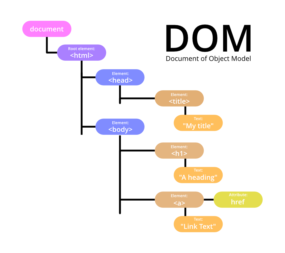
Browser Environment
When you open a webpage, the browser creates a special environment to run JavaScript. This environment includes:
- The window object: Represents the browser window or tab
- The document object: Represents the webpage content
DOM Tree Structure
The DOM represents HTML as a tree-like structure of objects. Each HTML tag becomes an object, nested tags become child objects of their parent. Text within tags becomes text objects.
Imagine your HTML document as a family tree:
- The
<html>tag is the root (great-grandparent) - Tags inside
<html>(like<head>and<body>) are its children - Tags inside these are grandchildren, and so on
Example:
<!DOCTYPE html>
<html>
  <head>
    <title>My Page</title>
  </head>
  <body>
    <h1>Welcome!</h1>
    <p>This is my page.</p>
  </body>
</html>
In this tree:
<html>is the root<head>and<body>are children of<html><title>is a child of<head><h1>and<p>are children of<body>
Traversing the DOM
You can move through the DOM tree using properties like:
- parentNode: Get the parent of an element
- childNodes: Get all child nodes of an element
- firstChild / lastChild: Get the first or last child of an element
- nextSibling / previousSibling: Get the next or previous sibling of an element
Code Examples:
Accessing Parent Node
//parentNode
//Returns the parent of the specified node in the DOM tree.
const parent = element.parentNode;

//parentElement
//Similar to parentNode, but returns null if the parent is not an element node.
const parentEl = element.parentElement;
Accessing the Child Node
//childNodes
//Returns a live NodeList of child nodes.
const childNodes = element.childNodes;

// children
// Returns a live HTMLCollection of child elements.
const children = element.children;

// firstChild and lastChild
// Return the first and last child nodes, respectively.
const firstNode = element.firstChild;
const lastNode = element.lastChild;

// firstElementChild and lastElementChild
// Return the first and last child elements, respectively.
const firstElement = element.firstElementChild;
const lastElement = element.lastElementChild;
Accessing the Sibling Node
// nextSibling and previousSibling
// Return the next and previous sibling nodes, respectively.
const nextNode = element.nextSibling;
const prevNode = element.previousSibling;

// nextElementSibling and previousElementSibling
// Return the next and previous sibling elements, respectively.
const nextElement = element.nextElementSibling;
const prevElement = element.previousElementSibling;
DOM Selection and Manipulation
Selecting Elements
To work with elements, you first need to select them. Here are some common methods:
-
getElementById: Find an element by its IDlet title = document.getElementById('main-title'); -
getElementsByClassName: Find elements by their class namelet paragraphs = document.getElementsByClassName('content'); -
getElementsByTagName: Find elements by their tag namelet allDivs = document.getElementsByTagName('div'); -
querySelector: Find the first element that matches a CSS selectorlet firstButton = document.querySelector('button'); -
querySelectorAll: Find all elements that match a CSS selectorlet allButtons = document.querySelectorAll('button');
DOM Manipulation
Once elements are selected, you can manipulate them in various ways:
2.1 Changing Content
textContent: Sets or returns the text content of an element.
element.textContent = 'New text content';
innerHTML: Sets or returns the HTML content inside an element.
element.innerHTML = '<strong>New HTML content</strong>';
2.2 Changing Attributes
setAttribute(): Sets the value of an attribute on the specified element.
element.setAttribute('class', 'newClass');
removeAttribute(): Removes an attribute from the specified element.
element.removeAttribute('class');
2.3 Changing Styles
style property: Allows direct manipulation of an element's inline styles.
element.style.color = 'red';
element.style.fontSize = '20px';
classList: Provides methods to add, remove, or toggle classes.
element.classList.add('newClass');
element.classList.remove('oldClass');
element.classList.toggle('activeClass');
2.4 Creating and Removing Elements
createElement(): Creates a new element.
const newDiv = document.createElement('div');
appendChild(): Adds a node to the end of the list of children of a specified parent node.
parentElement.appendChild(newDiv);
removeChild(): Removes a child node from the DOM.
parentElement.removeChild(childElement);
Example: Lets put it all together
// Select the container
const container = document.getElementById('container');

// Create a new paragraph
const newParagraph = document.createElement('p');
newParagraph.textContent = 'This is a new paragraph.';
newParagraph.classList.add('highlight');

// Append the new paragraph to the container
container.appendChild(newParagraph);
Node Properties
Once you've selected an element, you can access its properties:
nodeType: Type of the node (1 for element nodes, 3 for text nodes)nodeName/tagName: For element nodes, this is the tag name (in uppercase)innerHTML: The HTML content inside the elementouterHTML: The full HTML of the element, including the element itselftextContent: All text content of the element and its descendantshidden: If true, the element is hidden on the page
Example:
let paragraph = document.querySelector('p');

console.log(paragraph.nodeType);  // 1 (Element node)
console.log(paragraph.tagName);   // "P"
console.log(paragraph.innerHTML); // The HTML content inside the paragraph
console.log(paragraph.textContent); // Just the text, without HTML tags
Attributes and Properties
Element Attributes
HTML elements can have attributes, like id, class, src, etc. You can work with these in JavaScript:
-
Check if an attribute exists:
element.hasAttribute('attributeName') -
Get the value of an attribute:
element.getAttribute('attributeName') -
Set the value of an attribute:
element.setAttribute('attributeName', 'value') -
Remove an attribute:
element.removeAttribute('attributeName')
Element Properties
Most HTML attributes have corresponding JavaScript properties. For example, the id attribute corresponds to the id property:
let div = document.querySelector('div');
console.log(div.id);  // Reads the 'id' attribute
div.id = 'new-id';    // Sets the 'id' attribute
Document Structure and Content
You can access key parts of the document easily:
document.documentElement: The<html>tagdocument.body: The<body>tagdocument.head: The<head>tag
console.log(document.body.tagName); // "BODY"
Styling and Layout
Element Sizing and Scrolling
You can get information about an element's size and scroll position:
offsetWidth / offsetHeight: Full size of an element, including bordersclientWidth / clientHeight: Size of the content area inside the element (excluding borders and scrollbars)scrollWidth / scrollHeight: Full scrollable area of the elementscrollLeft / scrollTop: How much of the element is scrolled horizontally/vertically
Example:
let div = document.querySelector('div');
console.log("Full width:", div.offsetWidth);
console.log("Content width:", div.clientWidth);
console.log("Scrollable width:", div.scrollWidth);
console.log("Scrolled from left:", div.scrollLeft);
Window Sizes and Scrolling
You can also get information about the browser window:
window.innerWidth / window.innerHeight: Size of the browser window viewportdocument.documentElement.clientWidth / clientHeight: Size of the documentwindow.pageXOffset / pageYOffset: Current scroll position
Example:
console.log("Window width:", window.innerWidth);
console.log("Document width:", document.documentElement.clientWidth);
console.log("Scrolled from top:", window.pageYOffset);
Browser Events
What are Events?
Events are things that happen in the system you're programming. The system tells you about events so your code can react to them.
Common Event Types
- Mouse events:
click,dblclick,mousedown,mouseup,mousemove - Keyboard events:
keydown,keyup,keypress - Form events:
submit,focus,blur - Window events:
load,resize,scroll - Document events:
DOMContentLoaded
Adding Event Listeners
There are three main ways to add event listeners:
- HTML attribute (not recommended for modern development):
<button onclick="alert('Clicked!')">Click me</button>
- DOM property:
let button = document.querySelector('button');
button.onclick = function() {
  alert('Clicked!');
};
- addEventListener method (recommended):
let button = document.querySelector('button');
button.addEventListener('click', function() {
  alert('Clicked!');
});
Event Object
When an event happens, the browser creates an event object with details about the event. This object is automatically passed to the event handler:
button.addEventListener('click', function(event) {
  console.log('Button clicked at coordinates: ' + event.clientX + ', ' + event.clientY);
});
Event Propagation
When an event happens on an element, it first runs the handlers on it, then on its parent, then all the way up on other ancestors. This is called "bubbling". Example:
<div id="outer">
  <div id="inner">Click me</div>
</div>

<script>
  document.getElementById('outer').addEventListener('click', function() {
    alert('Outer div clicked');
  });

  document.getElementById('inner').addEventListener('click', function() {
    alert('Inner div clicked');
  });
</script>
If you click on the inner div, you'll see "Inner div clicked" then "Outer div clicked".
Event Delegation
Instead of assigning an event handler to each similar element, you can use event delegation. Add the event listener to a parent element and have it catch events that happen on its children.
<ul id="todo-list">
  <li>Task 1</li>
  <li>Task 2</li>
  <li>Task 3</li>
</ul>

<script>
  document.getElementById('todo-list').addEventListener('click', function(event) {
    if (event.target.tagName === 'LI') {
      alert('Task clicked: ' + event.target.textContent);
    }
  });
</script>
This way, you can handle clicks on any number of list items with just one event listener.
Browser Default Actions and Custom Events
Preventing Default Actions
Browsers have default actions for many events (like following a link when clicked). You can prevent these with event.preventDefault():
let link = document.querySelector('a');
link.addEventListener('click', function(event) {
  event.preventDefault();  // Prevents following the link
  alert('Link clicked, but not followed');
});
Creating Custom Events
Custom events in java script is a powerful features that allows developers to create and trigger their own events
You can create your own events:
// Create a custom event
let myEvent = new Event('myCustomEvent');

// Add a listener for the custom event
document.addEventListener('myCustomEvent', function() {
  alert('Custom event occurred!');
});

// Dispatch the custom event
document.dispatchEvent(myEvent);
Bubble
Event Bubbling is a term in the DOM where the event an element receives is bubbled (transmitted) to its parent and ancestors, upward in the DOM tree, until it gets to the root.
Example:
<body>

    <div id="parent">
        Parent Div
        <div id="child">Child Div</div>
    </div>

    <script>
        // Event listener on parent
        document.getElementById("parent").addEventListener("click", function() {
            alert("Parent clicked!");
        });

        // Event listener on child
        document.getElementById("child").addEventListener("click", function(event) {
            alert("Child clicked!");
        });
    </script>

</body>
When you click the "Child Div," you'll see two alerts: "Child clicked!" followed by "Parent clicked!" because the event bubbles up from the child to the parent.
Bubbling behavior can be stopped using event.stopPropagation() line in the child event handler.
Types of Mouse Events
mousedown/mouseup: Mouse button is pressed / releasedclick: Triggered after mousedown and mouseup on the same elementdblclick: Double clickmousemove: Mouse is movedmouseover/mouseout: Mouse enters / leaves an element
Mouse Event Properties
clientX/clientY: Coordinates relative to the windowpageX/pageY: Coordinates relative to the documentwhich: Which mouse button was pressed (1: left, 2: middle, 3: right)
Example:
document.addEventListener('mousemove', function(event) {
  console.log('Mouse position:', event.clientX, event.clientY);
});
Drag and Drop
You can implement drag and drop functionality using mouse events:
let draggable = document.getElementById('draggable');
let isDragging = false;
let startX, startY;

draggable.addEventListener('mousedown', function(event) {
  isDragging = true;
  startX = event.clientX - draggable.offsetLeft;
  startY = event.clientY - draggable.offsetTop;
});

document.addEventListener('mousemove', function(event) {
  if (isDragging) {
    draggable.style.left = (event.clientX - startX) + 'px';
    draggable.style.top = (event.clientY - startY) + 'px';
  }
});

document.addEventListener('mouseup', function() {
  isDragging = false;
});
Pointer Events
Pointer events are a modern way to handle input from a variety of pointing devices, such as a mouse, a pen/stylus, a touchscreen, and more.
Pointer Event Types
Pointer events are named similarly to mouse events:
| Pointer Event | Similar Mouse Event |
|---|---|
pointerdown | mousedown |
pointerup | mouseup |
pointermove | mousemove |
pointerover | mouseover |
pointerout | mouseout |
pointerenter | mouseenter |
pointerleave | mouseleave |
pointercancel | - |
gotpointercapture | - |
lostpointercapture | - |
Pointer Event Properties
Pointer events have the same properties as mouse events, such as clientX, clientY, target, etc., with additional properties:
pointerId: Unique identifier of the pointer causing the event. Useful for handling multiple pointers (e.g., multi-touch).pointerType: Type of pointing device, can be"mouse","pen", or"touch".isPrimary:truefor the primary pointer (first finger in multi-touch).
Keydown and Keyup
The keydown event occurs when a key is pressed down, and keyup when it’s released.
document.addEventListener('keydown', function(event) {
  console.log('Key pressed:', event.key);
  if (event.key === 'Enter') {
    alert('Enter key pressed!');
  }
});
event.code and event.key
event.key: Returns the character of the key pressed.event.code: Returns the physical key code.
Example:
| Key | event.key | event.code |
|---|---|---|
| Z | z (lowercase) | KeyZ |
| Shift+Z | Z (uppercase) | KeyZ |
Scrolling
The scroll event allows reacting to page or element scrolling. It can be useful for:
- Showing/hiding additional controls or information based on scroll position.
- Loading more data when the user scrolls to the end of the page.
window.addEventListener('scroll', function() {
  console.log('Scrolled to:', window.pageYOffset);
});
Prevent Scrolling
You can’t prevent scrolling directly using event.preventDefault() in a scroll event listener since it triggers after the scroll has already happened.
Instead, prevent the scroll-triggering event, like keydown for pageUp or pageDown. Alternatively, use CSS with the overflow property to control scroll behavior.
Before we dive into JavaScript, let's quickly review what an HTML form looks like:
<form id="myForm">
  <input type="text" name="username" id="usernameInput">
  <input type="password" name="password" id="passwordInput">
  <button type="submit">Submit</button>
</form>
This creates a simple form with a text input for a username, a password input, and a submit button.
1. Form Properties and Methods
Accessing Forms
JavaScript provides several ways to access forms on a webpage:
- Using
document.forms:
// Access the first form on the page
let firstForm = document.forms[0];

// Access a form by its name or id
let myForm = document.forms.myForm;
// or
let myForm = document.forms['myForm'];
- Using query selectors:
// Using getElementById
let myForm = document.getElementById('myForm');

// Using querySelector
let myForm = document.querySelector('#myForm');
Accessing Form Elements
Once you have a reference to a form, you can access its elements:
- Using the
elementsproperty:
let form = document.forms.myForm;

// Access by name
let usernameInput = form.elements.username;

// Access by index
let passwordInput = form.elements[1];
- Using query selectors on the form:
let usernameInput = form.querySelector('#usernameInput');
Form Properties
Forms have several useful properties:
form.length: Returns the number of elements in the form.
console.log(form.length); // Outputs: 3 (2 inputs + 1 button)
form.name: Gets or sets the name of the form.
console.log(form.name);  // Outputs: "myForm"
form.name = "newFormName";
form.method: Gets or sets the HTTP method used to submit the form.
console.log(form.method);  // Outputs: "get" (default)
form.method = "post";
form.action: Gets or sets the URL where the form data will be submitted.
console.log(form.action);  // Outputs: current page URL by default
form.action = "https://example.com/submit";
Form Methods
Forms also have methods you can use:
-
form.submit(): Submits the form programmatically. -
form.reset(): Resets all form elements to their default values.
2. Focus
Focus determines which element is ready to accept input from the keyboard. It's an important concept for form usability and accessibility.
Setting Focus
You can set focus to an element using the focus() method:
let usernameInput = document.getElementById('usernameInput');
usernameInput.focus();
This will move the cursor to the username input field, ready for the user to type.
Removing Focus
To remove focus from an element, use the blur() method:
usernameInput.blur();
Checking Focus
You can check if an element has focus using the :focus pseudo-class in CSS, or the document.activeElement property in JavaScript:
if (document.activeElement === usernameInput) {
  console.log('Username input has focus');
}
Focus Events
There are two main focus-related events:
focus: Fired when an element receives focus.blur: Fired when an element loses focus.
Example:
usernameInput.addEventListener('focus', function() {
  console.log('Username input focused');
});

usernameInput.addEventListener('blur', function() {
  console.log('Username input lost focus');
});
3. Form Submission
Form submission is the process of sending form data to a server.
The Submit Event
When a form is submitted (either by clicking a submit button or pressing Enter in a text field), it triggers a submit event. You can listen for this event to perform actions before the form is sent:
form.addEventListener('submit', function(event) {
  // Prevent the form from submitting normally
  event.preventDefault();

  console.log('Form is being submitted');

  // You can perform validation or other actions here
});
Validating Form Data
Before submitting a form, you often want to check if the data is valid. Here's a simple example:
form.addEventListener('submit', function(event) {
  event.preventDefault();

  let username = form.elements.username.value;
  let password = form.elements.password.value;

  if (username.length < 3) {
    alert('Username must be at least 3 characters long');
    return;
  }

  if (password.length < 6) {
    alert('Password must be at least 6 characters long');
    return;
  }

  // If we get here, the form is valid
  console.log('Form is valid, submitting...');
  this.submit();
});
Exercise - Basic form validation
Implement a client-side form validation script that checks user input in real-time for a registration form.
The form should include fields for username, email, password, and password confirmation.
Validate each field as the user types, displaying error messages dynamically without page reload. Implement checks for username length, email format, password strength (including minimum length, uppercase, lowercase, and special characters), and password match.
Use JavaScript to handle the validation logic and DOM manipulation for displaying error messages. Additionally, disable the submit button until all fields pass validation
Introduction to Web Components
Web components are a set of web platform APIs that allow you to create new custom, reusable, encapsulated HTML tags to use in web pages and web apps.
Key Features of Web Components:
-
Custom Elements: Allow developers to create new HTML tags, extend existing HTML tags, or extend other developers' tags.
-
Shadow DOM: Provides encapsulation for JavaScript, CSS, and templating in a Web Component. It keeps the component's internal structure separate from the main document's DOM.
-
HTML Templates: The
<template>and<slot>elements enable you to write markup templates that are not displayed in the rendered page but can be used to define the structure of a custom element.
Benefits of Web Components:
- Reusability: Create components once and use them across different projects.
- Encapsulation: The internal workings of a component are hidden, reducing style and script conflicts.
- Standard-based: Built on web standards, ensuring better compatibility and longevity.
- Framework-agnostic: Can be used with any JavaScript library or framework that works with HTML.
Extending HTMLElement
To create a custom element, you need to create a JavaScript class that extends HTMLElement:
class MyCustomElement extends HTMLElement {
  constructor() {
    super();
    // Element functionality written here
  }
}
Custom Element Naming
When naming custom elements, follow these rules:
- The name must contain a hyphen (-). This is to ensure that there are no naming conflicts with current or future standard HTML elements.
- You can't register the same tag name more than once.
- Custom elements can't be self-closing. They must have separate opening and closing tags.
Examples of valid custom element names:
<my-element><my-awesome-app>
Defining a Custom Element
To define a custom element, use the customElements.define() method:
customElements.define('my-element', MyCustomElement);
This associates the MyCustomElement class with the <my-element> tag.
Example
class MyCustomElement extends HTMLElement {
  constructor() {
    super();
  }
}

customElements.define('my-element', MyCustomElement);
Adding Content, Styling, and Interactivity
Adding Content
You can add content to your custom element in several ways:
- In the constructor:
class MyElement extends HTMLElement {
  constructor() {
    super();
    this.textContent = 'Hello, World!';
  }
}
- Using
connectedCallback:
class MyElement extends HTMLElement {
  connectedCallback() {
    this.innerHTML = '<h1>Hello, World!</h1>';
  }
}
- Using Shadow DOM:
class MyElement extends HTMLElement {
  constructor() {
    super();
    const shadow = this.attachShadow({mode: 'open'});
    shadow.innerHTML = '<h1>Hello, Shadow DOM!</h1>';
  }
}
Styling
You can style your custom elements using several methods:
- External styles: Apply styles from your main CSS file.
- Internal styles: Define styles within the Shadow DOM.
:hostselector: Style the custom element itself from within.
Example of internal styling:
class MyElement extends HTMLElement {
  constructor() {
    super();
    const shadow = this.attachShadow({mode: 'open'});
    shadow.innerHTML = `
      <style>
        h1 { color: red; }
      </style>
      <h1>Hello, Styled World!</h1>
    `;
  }
}
Adding Interactivity
You can add interactivity to your custom elements using standard JavaScript event listeners:
class MyButton extends HTMLElement {
  constructor() {
    super();
    this.addEventListener('click', () => {
      console.log('Custom button clicked!');
    });
  }

  connectedCallback() {
    this.innerHTML = '<button>Click me!</button>';
  }
}

customElements.define('my-button', MyButton);
Components Reusability; Attributes, Properties; Customization
Reusability
Web Components are inherently reusable. Once defined, you can use your custom element anywhere in your HTML just like a standard HTML element.
Attributes and Properties
Attributes and properties allow you to customize the behavior of your components.
Attributes
You can define custom attributes for your element and react to changes:
class UserCard extends HTMLElement {
  static get observedAttributes() {
    return ['name', 'avatar'];
  }

  attributeChangedCallback(name, oldValue, newValue) {
    if (name === 'name') {
      this.querySelector('.name').textContent = newValue;
    } else if (name === 'avatar') {
      this.querySelector('img').src = newValue;
    }
  }

  connectedCallback() {
    this.innerHTML = `
      <img src="${this.getAttribute('avatar') || 'default.jpg'}">
      <p class="name">${this.getAttribute('name')}</p>
    `;
  }
}

customElements.define('user-card', UserCard);
Usage:
<user-card name="John Doe" avatar="john.jpg"></user-card>
Properties
You can also define properties on your custom element:
class MyCounter extends HTMLElement {
  constructor() {
    super();
    this._count = 0;
  }

  get count() {
    return this._count;
  }

  set count(value) {
    this._count = value;
    this.textContent = `Count: ${this._count}`;
  }

  connectedCallback() {
    this.textContent = `Count: ${this._count}`;
  }
}

customElements.define('my-counter', MyCounter);
Usage:
const counter = document.querySelector('my-counter');
counter.count = 5; // This will update the displayed count
Customization
Web Components can be customized in various ways:
- Attributes: As shown above, use attributes to pass data into your component.
- Slots: Use the
<slot>element to define placeholders in your component that can be filled with custom content.
Example using slots:
class MyCard extends HTMLElement {
  constructor() {
    super();
    this.attachShadow({mode: 'open'});
    this.shadowRoot.innerHTML = `
      <style>
        .card { border: 1px solid #ccc; padding: 10px; }
        .title { font-weight: bold; }
      </style>
      <div class="card">
        <div class="title"><slot name="title">Default Title</slot></div>
        <div><slot>Default content</slot></div>
      </div>
    `;
  }
}

customElements.define('my-card', MyCard);
Usage:
<my-card>
  <span slot="title">Custom Title</span>
  <p>This is the main content of the card.</p>
</my-card>
This allows users of your component to customize its content while maintaining its structure and styling.
By leveraging these features—attributes, properties, and slots—you can create highly reusable and customizable Web Components that can be used across different projects and contexts.
Web Components API Lifecycle Methods
Web Components have several built-in lifecycle methods that allow you to hook into different stages of the component's lifecycle:
connectedCallback(): Called when the component is inserted into the DOM.disconnectedCallback(): Called when the component is removed from the DOM.adoptedCallback(): Called when the component is moved to a new document.attributeChangedCallback(name, oldValue, newValue): Called when an observed attribute of the component changes.
These methods allow you to perform setup, cleanup, and other actions at the appropriate times during the component's lifecycle.
Modular Development
Web Components enable modular development by allowing you to encapsulate functionality, styles, and markup within a self-contained unit. This promotes code reuse, maintainability, and separation of concerns.
Some best practices for modular development with Web Components include:
-
Encapsulate Functionality: Implement all the logic, styles, and markup related to a specific feature or UI element within a single custom element.
-
Separate Concerns: Keep the component's internal implementation details hidden from the outside world, exposing only the necessary API (attributes, properties, methods).
-
Dependency Management: Manage dependencies between components carefully to avoid conflicts and ensure predictable behavior.
-
Composability: Design components to be composable, allowing them to be combined and nested to build more complex UIs.
Dependency Problems; Wrapping Third-Party Libraries
Dependency Problems
When working with Web Components, you may encounter dependency-related issues, such as:
- Global Namespace Conflicts: Multiple components using the same global variable or function name can lead to unintended interactions.
- CSS Leakage: Styles defined in one component can unintentionally "leak" into other components, causing visual issues.
- Versioning Conflicts: Different components relying on different versions of the same third-party library can cause compatibility problems.
Wrapping Third-Party Libraries
To address these issues, you can wrap third-party libraries within your Web Components. This provides several benefits:
- Encapsulation: The component's internal implementation, including any third-party dependencies, is hidden from the outside world.
- Versioning: You can manage the version of the third-party library independently, without affecting other components.
- Customization: You can customize the third-party library's behavior, adapting it to the specific needs of your component.
Example of wrapping a third-party library (Chart.js) within a Web Component:
class ChartComponent extends HTMLElement {
  constructor() {
    super();
    this.attachShadow({ mode: 'open' });

    // Load the Chart.js library within the component's shadow DOM
    const chartScript = document.createElement('script');
    chartScript.src = 'https://cdn.jsdelivr.net/npm/chart.js';
    this.shadowRoot.appendChild(chartScript);
  }

  connectedCallback() {
    // Wait for the Chart.js library to load before rendering the chart
    chartScript.onload = () => {
      this.renderChart();
    };
  }

  renderChart() {
    const ctx = this.shadowRoot.createElement('canvas').getContext('2d');
    new Chart(ctx, {
      type: 'bar',
      data: {
        labels: ['Red', 'Blue', 'Yellow'],
        datasets: [{ data: [300, 50, 100] }]
      }
    });
  }
}

customElements.define('chart-component', ChartComponent);
By wrapping the third-party library within the component, you can ensure that it doesn't conflict with other components or the global namespace, and you can customize its behavior as needed.
Template Literals, String Manipulation
Web Components can benefit from the use of template literals and string manipulation techniques to create more dynamic and expressive markup.
Template Literals
Template literals, introduced in ES6, allow you to embed expressions within string literals using the backtick (`) character. This can be particularly useful when generating HTML content for your Web Components:
class MyElement extends HTMLElement {
  constructor() {
    super();
    this.attachShadow({ mode: 'open' });
    this.shadowRoot.innerHTML = `
      <style>
        h1 { color: ${this.getAttribute('color') || 'black'}; }
      </style>
      <h1>${this.getAttribute('title') || 'Default Title'}</h1>
      <p>${this.getAttribute('description') || 'Default description'}</p>
    `;
  }
}

customElements.define('my-element', MyElement);
In this example, the template literal is used to dynamically set the heading color and content based on the component's attributes.
String Manipulation
Beyond template literals, you can use various string manipulation techniques to generate and manipulate the HTML content of your Web Components:
class MyList extends HTMLElement {
  constructor() {
    super();
    this.attachShadow({ mode: 'open' });
    this.items = this.getAttribute('items').split(',').map(item => item.trim());
    this.shadowRoot.innerHTML = this.generateList();
  }

  generateList() {
    return `
      <style>
        ul { list-style-type: none; padding: 0; }
        li { padding: 5px; }
      </style>
      <ul>
        ${this.items.map(item => `<li>${item}</li>`).join('')}
      </ul>
    `;
  }
}

customElements.define('my-list', MyList);
In this example, the generateList() method uses array methods like map() and join() to dynamically generate the list items based on the items attribute.
These string manipulation techniques, combined with template literals, provide a powerful way to create dynamic and customizable HTML content within your Web Components.
Template Tag; Dynamic Template Loading
Template Tag
The <template> element in HTML is a powerful tool for defining reusable markup templates within Web Components. These templates are not rendered on the page but can be used to define the structure of your custom elements.
Example of using the <template> element:
<template id="my-element-template">
  <style>
    :host { display: block; }
    h1 { color: var(--heading-color, black); }
  </style>
  <h1><slot name="title">Default Title</slot></h1>
  <p><slot>Default content</slot></p>
</template>

<script>
  class MyElement extends HTMLElement {
    constructor() {
      super();
      const template = document.getElementById('my-element-template');
      const templateContent = template.content.cloneNode(true);
      this.attachShadow({ mode: 'open' }).appendChild(templateContent);
    }
  }

  customElements.define('my-element', MyElement);
</script>
In this example, the <template> element is used to define the structure and styling of the <my-element> custom element. The content of the template is then cloned and attached to the component's shadow root.
Dynamic Template Loading
You can also load templates dynamically, for example, from a separate HTML file. This allows you to keep your component's markup separate from the JavaScript code, promoting better modularity and maintainability.
class DynamicElement extends HTMLElement {
  constructor() {
    super();
    this.attachShadow({ mode: 'open' });
  }

  connectedCallback() {
    this.loadTemplate('dynamic-element-template.html')
      .then(templateContent => {
        this.shadowRoot.appendChild(templateContent.cloneNode(true));
      });
  }

  async loadTemplate(url) {
    const response = await fetch(url);
    const html = await response.text();
    const template = document.createElement('template');
    template.innerHTML = html;
    return template.content;
  }
}

customElements.define('dynamic-element', DynamicElement);
In this example, the DynamicElement class loads its template from a separate file, dynamic-element-template.html, using the loadTemplate() method. This method fetches the HTML content, creates a <template> element, and returns the template's content.
By separating the template from the component's JavaScript, you can make your code more modular and easier to maintain.
Shadow DOM; Style encapsulation; Slots, content projection
Shadow DOM
The Shadow DOM is a key concept in Web Components. It provides a way to encapsulate the internal structure and styles of a custom element, keeping them isolated from the main document's DOM. When you create a custom element, you can attach a shadow root to it using the attachShadow() method. This creates a separate DOM tree that is scoped to the custom element, with its own styles and event handling.
class MyElement extends HTMLElement {
  constructor() {
    super();
    this.attachShadow({ mode: 'open' });
    this.shadowRoot.innerHTML = '<h1>Hello from the Shadow DOM!</h1>';
  }
}

customElements.define('my-element', MyElement);
Style Encapsulation
The Shadow DOM ensures that styles defined within the custom element's shadow root are scoped to that element, preventing them from leaking out and affecting the rest of the page. This is known as style encapsulation. You can use the :host pseudo-class to target the custom element itself from within the shadow root:
:host {
  display: block;
  padding: 10px;
}

:host([disabled]) {
  opacity: 0.5;
}
Slots and Content Projection
Slots allow you to define placeholders in your custom element's template that can be filled with content from the outside. This is called content projection.
<template id="my-card-template">
  <style>
    .card { border: 1px solid #ccc; padding: 10px; }
  </style>
  <div class="card">
    <h2><slot name="title">Default Title</slot></h2>
    <div><slot>Default content</slot></div>
  </div>
</template>

<script>
  class MyCard extends HTMLElement {
    constructor() {
      super();
      const template = document.getElementById('my-card-template');
      this.attachShadow({ mode: 'open' }).appendChild(template.content.cloneNode(true));
    }
  }

  customElements.define('my-card', MyCard);
</script>
When using the <my-card> element, you can fill the slots with your own content:
<my-card>
  <span slot="title">Custom Title</span>
  <p>This is the main content of the card.</p>
</my-card>
This allows you to create flexible and customizable components.
Shadow CSS; Theming Components with CSS Variables
Shadow CSS
Styles defined within the shadow root of a custom element are scoped to that element, but you can also style the host element from within the shadow DOM using the :host selector.
:host {
  display: block;
  background-color: var(--bg-color, #f0f0f0);
}

:host([highlighted]) {
  background-color: var(--highlight-color, #ffff00);
}
Theming Components with CSS Variables
You can use CSS variables (also known as custom properties) to make your components themable. Define the variables within the shadow root and allow users to override them from the outside.
:host {
  --bg-color: #f0f0f0;
  --text-color: #333;
  --highlight-color: #ffff00;

  display: block;
  background-color: var(--bg-color);
  color: var(--text-color);
  padding: 10px;
}
Then, users can override the variables when using the component:
<my-element style="--bg-color: #007bff; --text-color: white; --highlight-color: #00ff00;">
  Custom themed content
</my-element>
This allows for easy theming and customization of your Web Components.
Combining Multiple Components; Common Design Language
Composing Components
Web Components are designed to be composed together to build more complex user interfaces. You can nest custom elements inside one another, creating a hierarchy of components.
<my-layout>
  <my-header>
    <my-logo></my-logo>
    <my-navigation-menu></my-navigation-menu>
  </my-header>
  <my-content>
    <my-card>
      <span slot="title">Card Title</span>
      <p>Card content goes here.</p>
    </my-card>
  </my-content>
  <my-footer></my-footer>
</my-layout>
This composition of components helps maintain a modular and maintainable codebase.
Common Design Language
When building a system of Web Components, it's important to establish a common design language. This includes:
-
Consistent Styling: Use a CSS-in-JS solution or CSS variables to ensure a unified visual style across all components.
-
Shared Behavior: Define common behaviors and interactions that are consistently applied across components.
-
Naming Conventions: Establish a clear naming convention for your custom elements to improve discoverability and understanding.
-
Documentation: Provide detailed documentation for each component, including its purpose, usage, and customization options.
By maintaining a common design language, you can create a cohesive and intuitive user experience, even when composing multiple Web Components together.
Exercise
Build a reusable card component using web components that can display various types of content. You should have a HTML file and a JavaScript file containing your Web Component implementation.
Your card component should:
-
Use a custom element with an appropriate name (following Web Components naming conventions)
-
Implement shadow DOM for style encapsulation
-
Include at least three different slot areas (e.g., header, content, footer)
-
Support customization through both attributes and CSS custom properties (variables)
-
Allow for different types of content (text, images, other HTML elements)
-
Maintain consistent styling while being visually customizable
Practice Questions:
- Create a custom element called "toggle-button" that:
- Displays a button that toggles between ON/OFF states
- Changes color based on state (green for ON, red for OFF)
- Dispatches a custom event called "toggle-changed" when clicked
- Maintains its state even if the page reloads (using localStorage)
- Create a custom element called "user-profile" that displays a user's name and role. The element should accept "name" and "role" attributes. Style it to have a card-like appearance with a border and padding.
- Create the UserProfile class that extends HTMLElement
- Define the custom element
- Add a template with basic styling
- Display the attribute values